


Python programming provides a helping hand towards Data Visualization. Plotting different kinds of charts in Python has never been easier as it is with the use of NumPy and Matplotlib libraries.
Let’s find out!
Prerequisites
For this particular tutorial, we require three libraries- Matplotlib, NumPy, and SciPy. To install these libraries on PyCharm, below step is must:
[ File> Settings> Project> Project Interpreter> + > install the libraries]
import matplotlib.pyplot as plt
import numpy as np
a. Plt and np becomes handy in the further code to reference the library again and again without writing the whole statement again.
- NumPy helps us in dealing with arrays and mathematical calculations.
- Matplotlib can be used to show these through graphs.
- SciPy is also a subpart of NumPy used for importing mathematical functions for forming charts and graphs.
Bubble Charts in Python
These can be used to plot random values on the chart as 3- dimensional. The default shape is a bubble or circles, and its size depends on its value.
Important Functions in Python
a. Plot() function: Used to plot the points or data on the graph.
b. Label([ ]) function: Used to label the axes ( x and y ) on the graph.
c. Title() function: Used to give heading to the graph.
d. Legend() function: Used to mention the data depicted through the graph.
e. Show() function: Used to display the generated graph.
f. Np. random.rand() function: This returns the given set of values in a uniform distribution with bubbles.
g. Plt.Scatter(x,y,sz): s here is to plot the random points with a particular size. S takes the argument of z to get the particular size multiplied by it’s vector length. We specify sz with a length equal to the vector length of x and y.
Let’s build our charts in Python:
Build Charts in Python
x = np.random.rand(40)
y = np.random.rand(40)
z = np.random.rand(40)
# Scatter Function for bubble chart:
plt.title("TechVidvan Chart 1")
plt.xlabel("X axis")
plt.ylabel("Y axis")
plt.scatter(x, y, s=z * 600, alpha=0.6,c="purple")
plt.show()
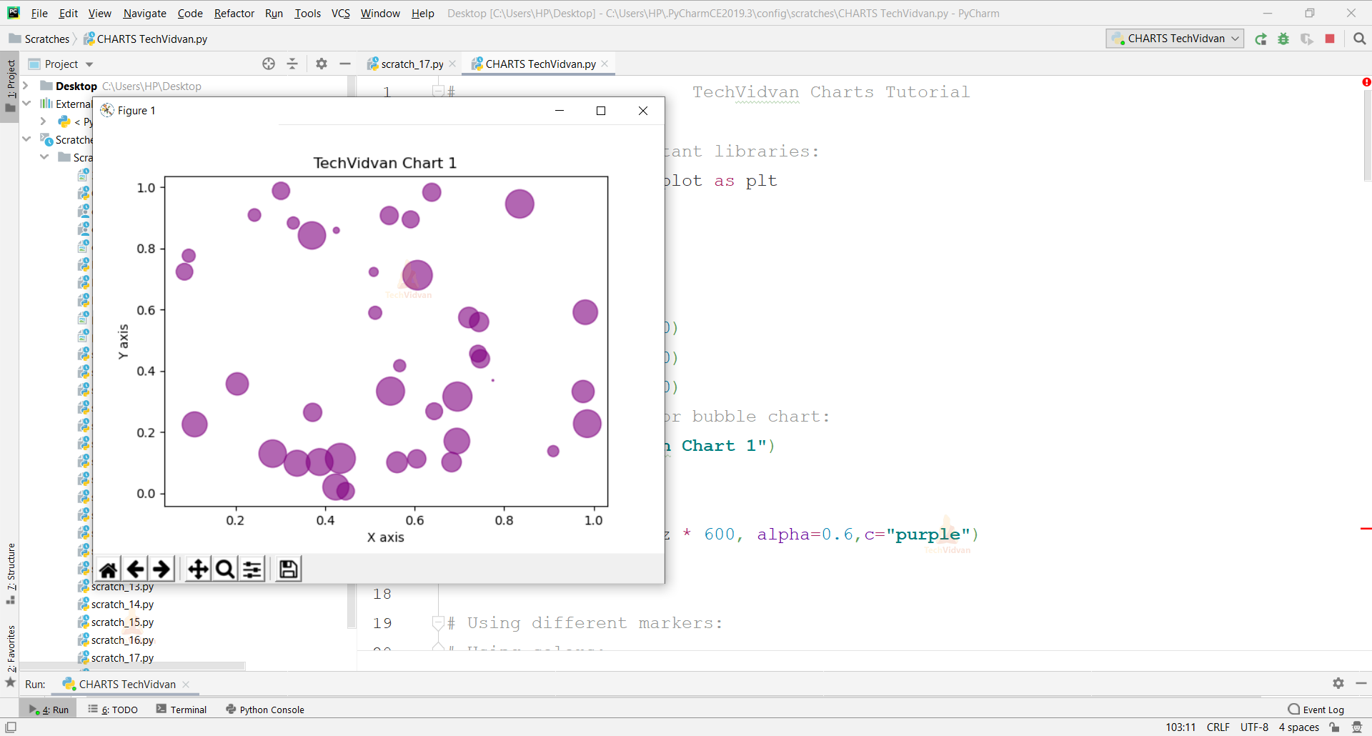
a. Alpha is to give transparency to the bubbles.
b. C= Used for giving color to the bubbles.
Markers in Python
Some Predefined symbols or numbers are used to present the data on the chart instead of just bubbles.
Let’s see its variety:
x=np.random.rand(30)
y=np.random.rand(30)
z=np.random.rand(30)
colors=np.random.rand(30)
plt.scatter(x,y,s=z*900,c=colors,marker="P")
plt.title("TechVidvan Chart 2")
plt.xlabel("X axis")
plt.ylabel("Y axis")
plt.show()
a. “P” in capital stands for a filled plus signed marker.
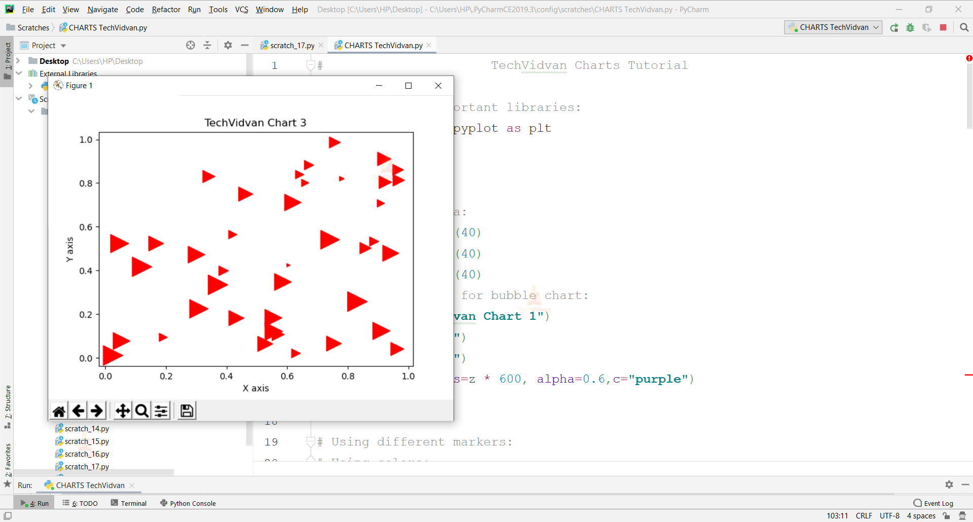
x=np.random.rand(40)
y=np.random.rand(40)
z=np.random.rand(40)
plt.scatter(x,y,s=z*500,c="red",marker=">")
plt.title("TechVidvan Chart 3")
plt.xlabel("X axis")
plt.ylabel("Y axis")
plt.show()

b. “>” displays right pointed triangles.
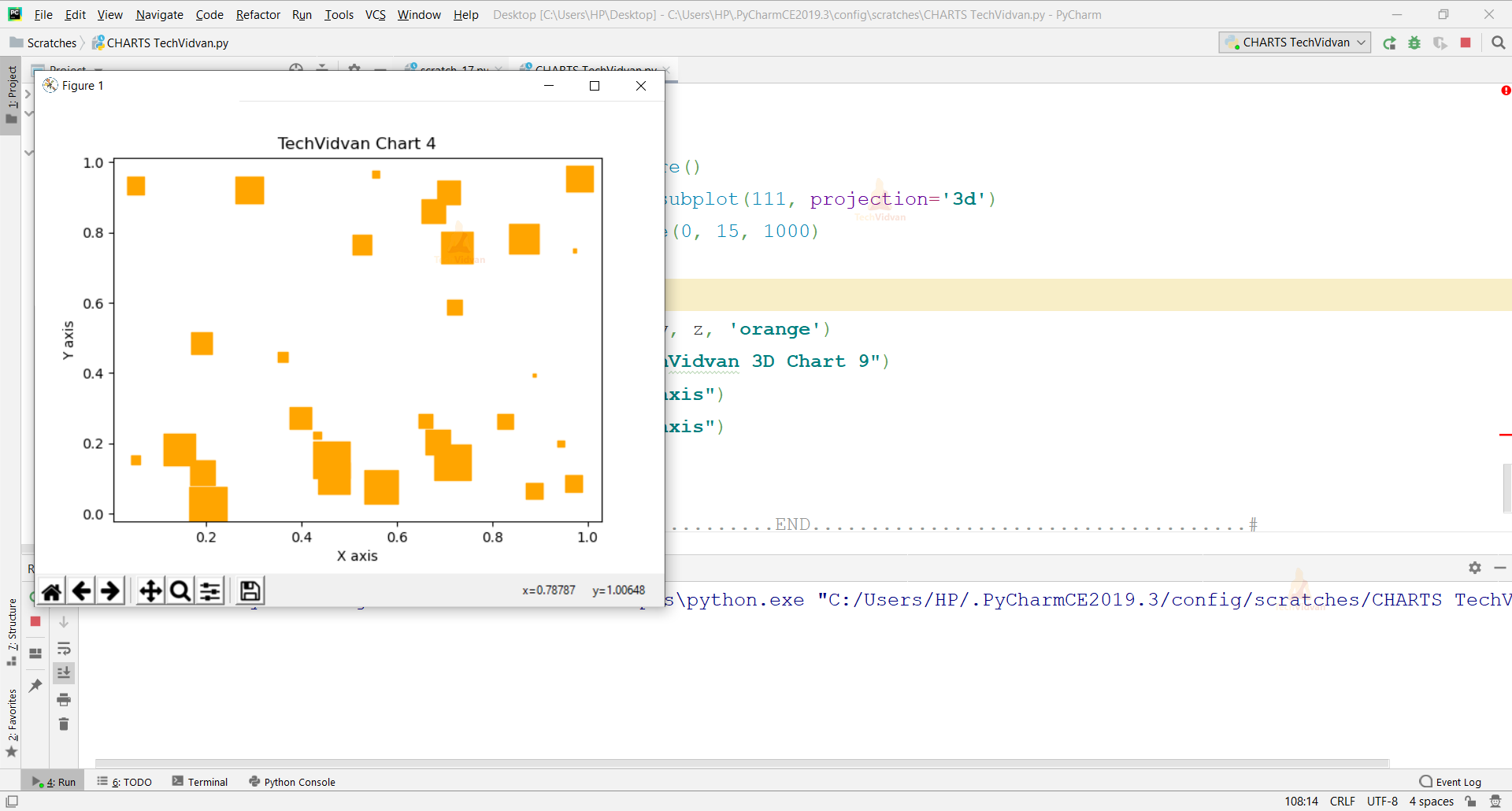
x=np.random.rand(30)
y=np.random.rand(30)
z=np.random.rand(30)
plt.scatter(x,y,s=z*770,c="orange",marker="s")
plt.title("TechVidvan Chart 4")
plt.xlabel("X axis")
plt.ylabel("Y axis")
plt.show()
c. “s” displays squares.
x=np.random.rand(50)
y=np.random.rand(50)
z=np.random.rand(50)
plt.scatter(x,y,s=z*800,c="black",marker="X")
plt.title("TechVidvan Chart 5")
plt.xlabel("X axis")
plt.ylabel("Y axis")
plt.show()
d. “x” displays filled X.

Styling Charts in Python
a. Edgecolors
x=np.random.rand(40)

y=np.random.rand(40)

z=np.random.rand(40)

plt.scatter(x,y,s=z*600,c="YellowGreen",marker="*",edgecolors="brown")

plt.title("TechVidvan Chart 6")

plt.xlabel("X axis")

plt.ylabel("Y axis")

plt.show()
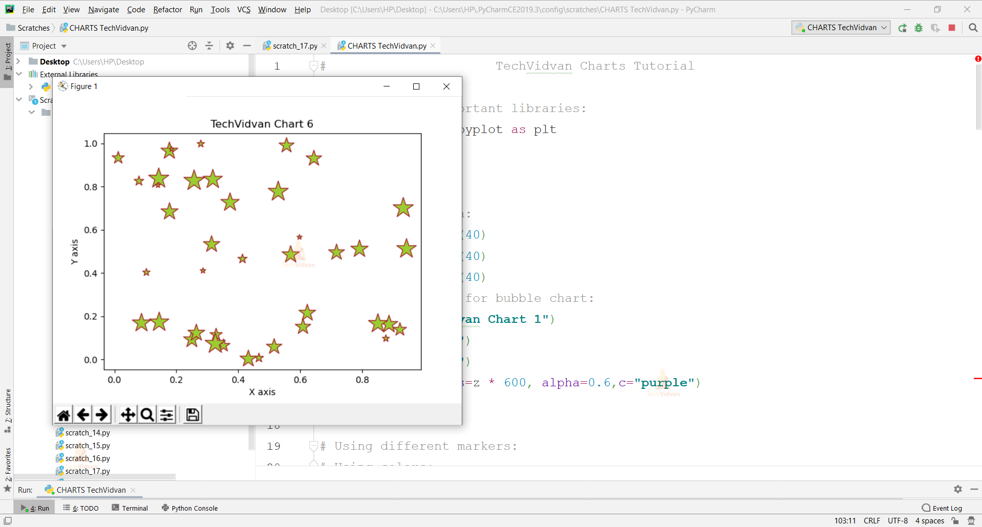
Edgecolors provide borders to the markers of a specific color.
b. Linewidth
x=np.random.rand(30)

y=np.random.rand(30)

z=np.random.rand(30)

plt.scatter(x,y,s=z*400,c="blue",marker="d",edgecolors="yellow",linewidths=3)

plt.title("TechVidvan Chart 7")

plt.xlabel("X axis")

plt.ylabel("Y axis")

plt.show()
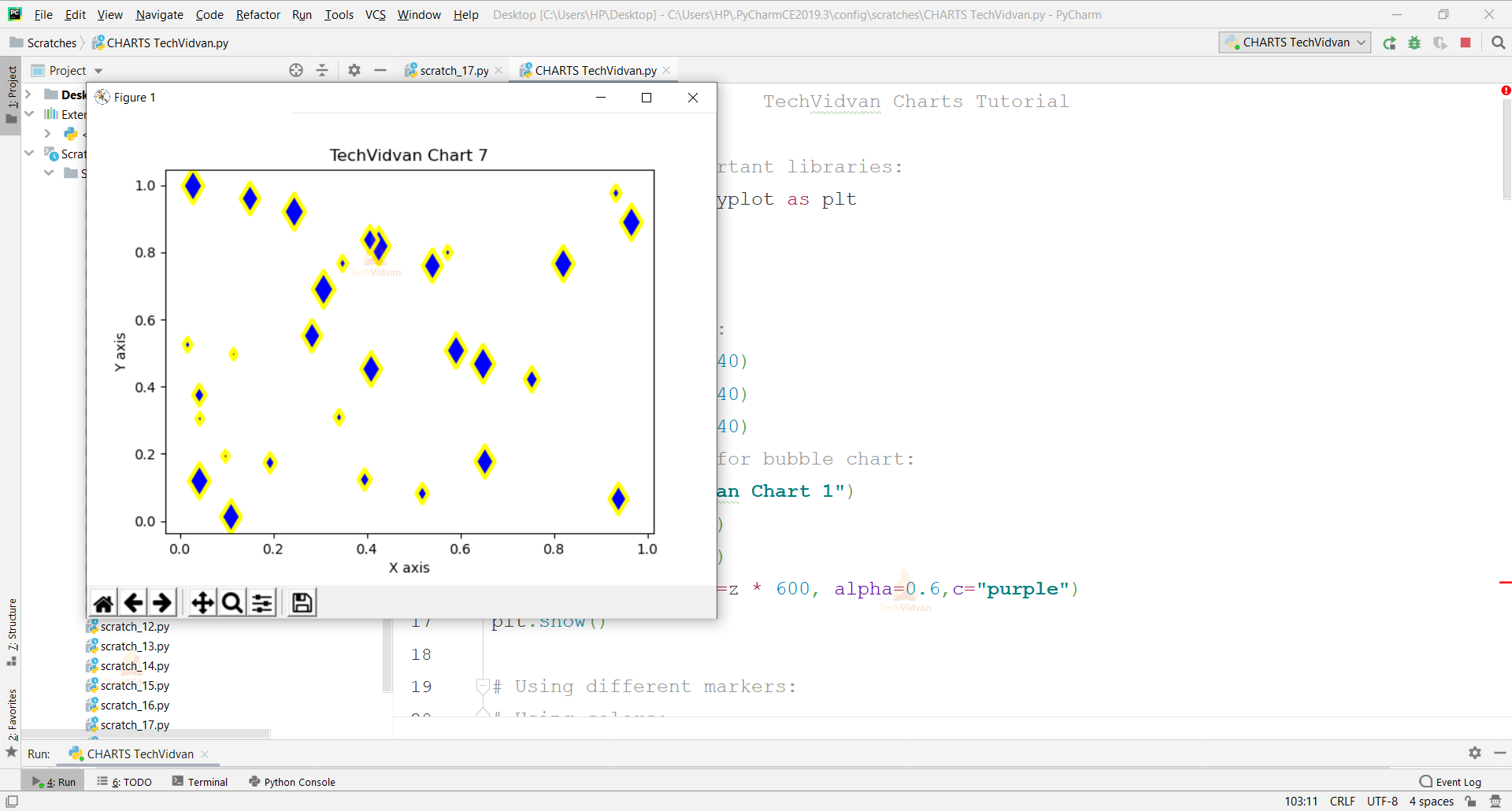
Linewidths determine the thickness of the border to markers.
c. Cmaps
x=np.random.rand(40)

y=np.random.rand(40)

z=np.random.rand(40)

plt.scatter(x,y,s=z*600,c=x,cmap="prism",linewidths=3)

plt.title("TechVidvan Chart 8")

plt.xlabel("X axis")

plt.ylabel("Y axis")

plt.show()
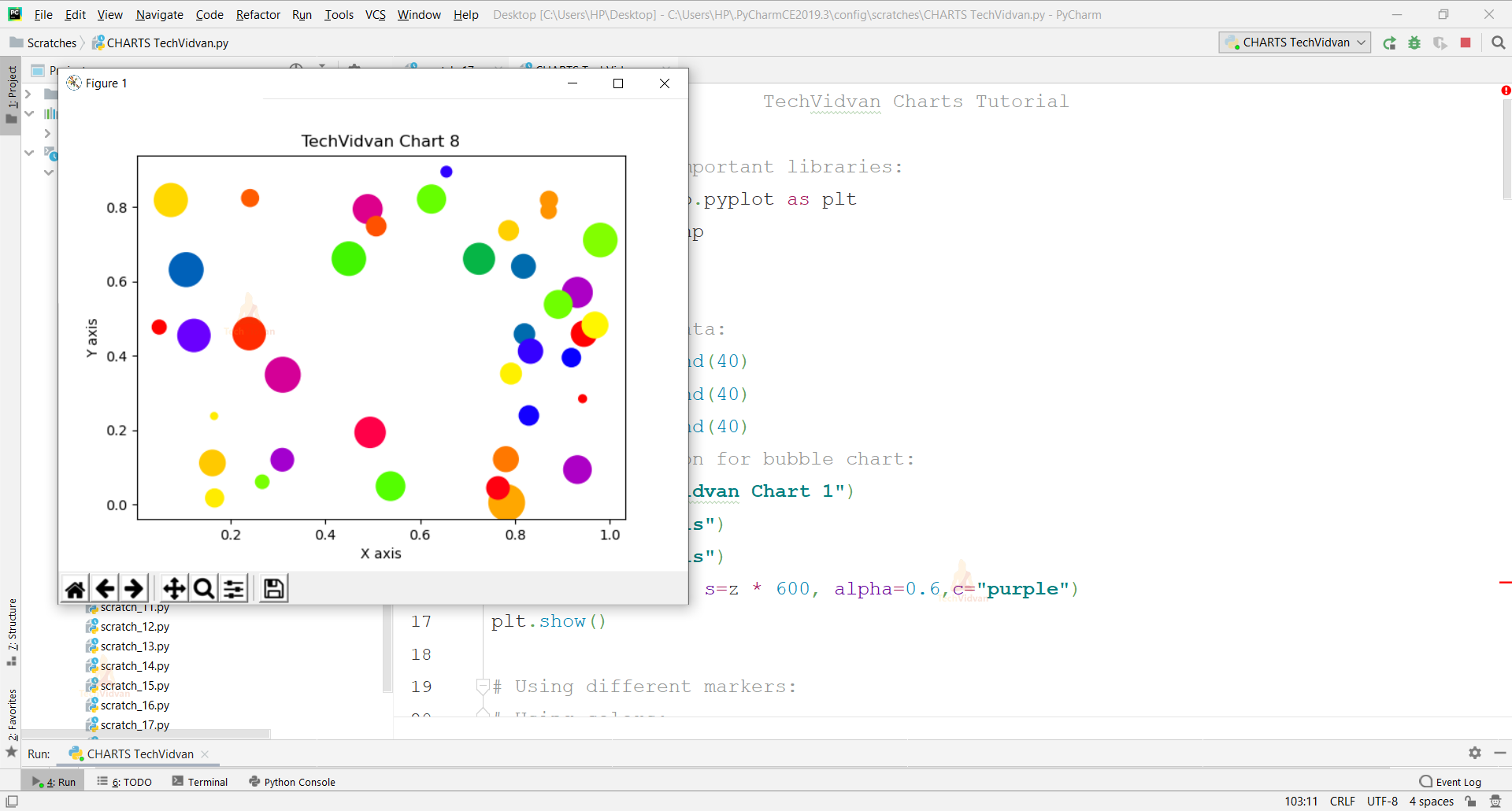
Cmap is a sequential color distribution already provided under matplotlib to use for the coloration of bubbles.
We have to initialize c first in scatter to use cmap.
The difference between colour and cmap is Color is just an rgb palette, whereas cmap is a predefined color reference, much easier to use.
d. Annotate
x=np.arange(0,10)

from scipy import cos

y=cos(x)

h="Cos curve"

plt.plot(x,y,"*")

plt.annotate(xy=[4,0],s=h)

plt.title("TechVidvan Cos Graph 9")

plt.show()
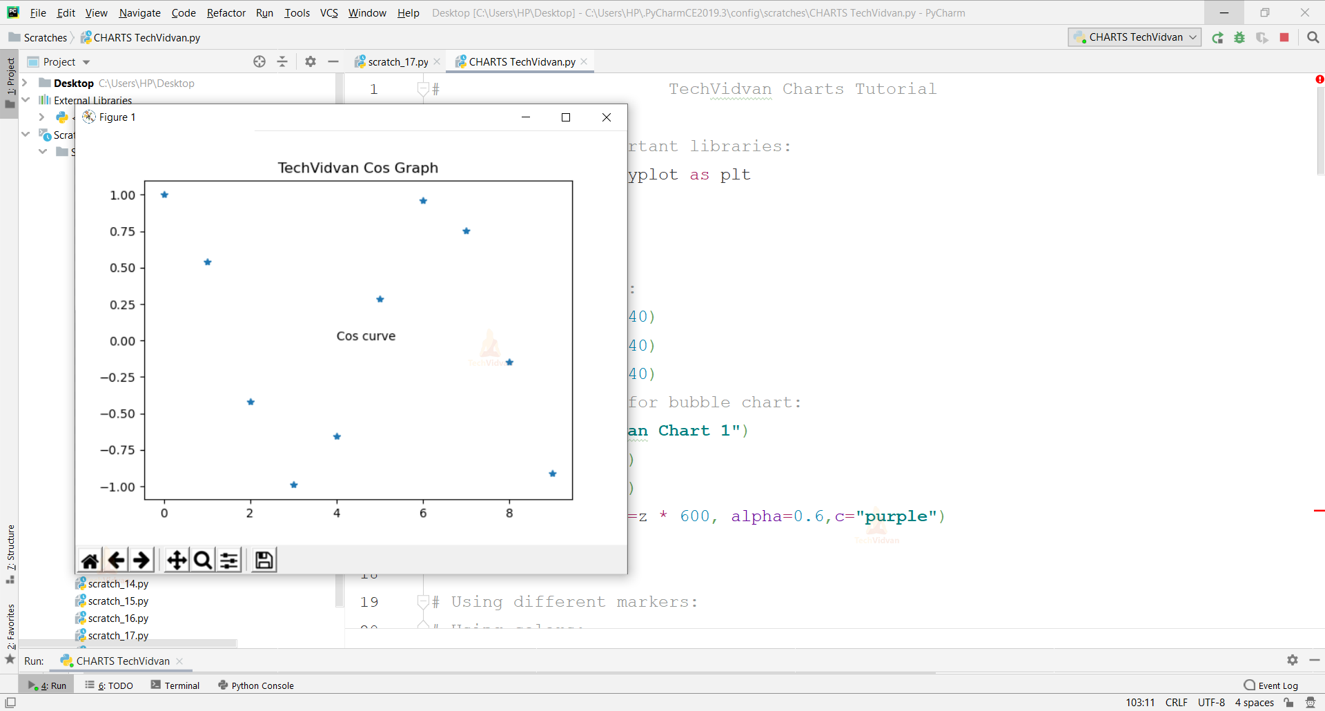
i. Np.arange() is to arrange the values according to a given range.
The stop range is not included in the chart.
ii. Plt.annotate() is to label the chart in between the range of values.
Xy defines the location, whereas s is the label we put.
3D Charts in Python
fig = plt.figure()

ax1 = fig.add_subplot(111, projection='3d')

z = np.linspace(0, 15, 1000)

x = np.sin(z)

y = np.cos(z)

ax1.plot3D(x, y, z, 'orange')

plt.title("TechVidvan 3D Chart 10")

plt.xlabel("X axis")

plt.ylabel("Y axis")

plt.show()
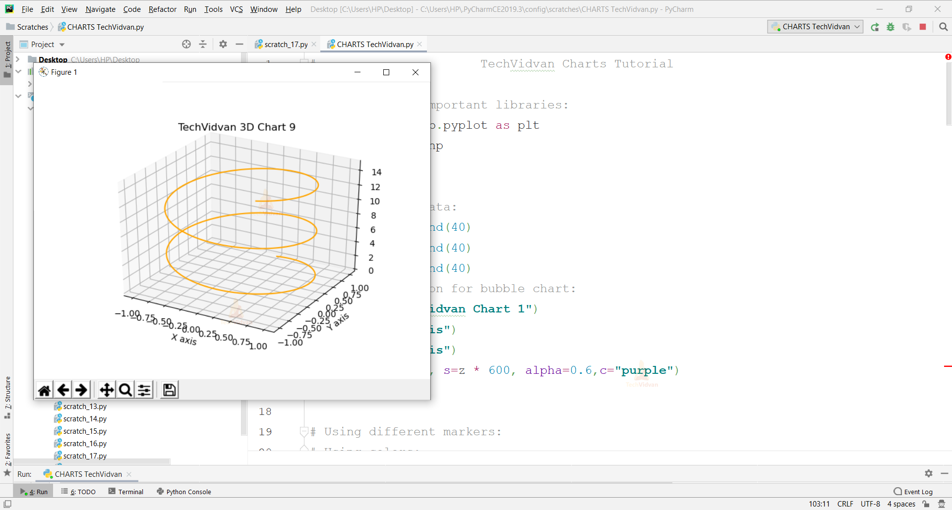
a. Plt.figure(): Used to create a figure space.
b. Add_subplot (p, q, r): Divides the whole figure into a p*q grid and places the created axes in the position of r.
c. Np.linspace(u, v, w): Starts the range at u, stops the range at v and w is the number of items to fit in between the range.
d. Plot3D(): Plots the graph in 3rd dimension.
Saving your Graphs
Adding this in the previous code,
plt.savefig("3d.png")
plt.show()

To save a plot in PNG form, savefig() function is useful in which the argument we pass is the type of graph we want to get in the image format plus the extension of .png after it.
Make sure to write this function before the show () function for the flow of execution the program code follows.
Conclusion
Hence, we learned how to make beautiful and creative bubble charts in Python of different features using Matplotlib and NumPy libraries.