


In this tutorial, we will learn about histograms and how to plot Histogram in Python? Let’s start!!!
What is Histogram?
Histograms are a display of statistical information that uses rectangles to show the frequency of data items in successive numerical intervals of the same size.
Nearly everyone can use an intuitive understanding of a histogram to visualize and comprehend the probability distribution of numerical data or image data. Python has many different options for creating and plotting histograms.
In Python, we can extensively use histograms in data visualization techniques using the “Matplotlib” library, a cross-platform data visualization and graphical plotting library for Python.
Types of Histogram:
Depending on the frequency distribution of the data, there are numerous ways to divide a histogram. There are several different types of distributions, including the gaussian distribution, the bimodal distribution, the skewed distribution, the comb distribution, the edge peak distribution, the multimodal distribution, the dog food distribution, and others. These various types of distributions can be depicted using the histogram. The several types of histograms include:
1. Hexagonal Histogram:
An even distribution suggests there are too few groups. The number of entries in each group is the same. It might consist of a distribution with numerous peaks, all of which have the same heights.
2. Equilateral Histogram:
A symmetric histogram is sometimes known as a bell-shaped histogram. If a vertical line is drawn through the middle of the histogram, the opposite sides are said to be symmetrical if they are the same size and form.
3. The bimodal histogram:
If a histogram has two peaks, it is said to be bimodal. Bimodality is present when data collection includes observations on two separate types of individuals or combined groups, and the centers of the two unique histograms are sufficiently removed from the variance in both data sets.
4. Statistical Histogram:
This histogram is a visual representation of a discontinuous probability distribution. A rectangle represents every x-value. Each rectangle’s area directly relates to the probability that the related value will occur.
Calculating histograms in NumPy: Starting from the base:
You’ve been utilizing what is referred to as “frequency tables” up to this point. The mapping of bins (intervals) to frequencies, however, is what a histogram is theoretically. Technically speaking, it can be applied to approximate the probability density function (PDF) of the underlying variable.
The “frequency table” above serves as an example of a genuine histogram, which “bins” the range of values first before counting the number of values that fit into each bin. The histogram() method in NumPy accomplishes this, and it serves as the foundation for other functions that you’ll find in Python libraries like Matplotlib and Pandas that you’ll encounter later.
How to create Histogram?
Creating a bin of the ranges is the first step in creating a histogram. Next, divide the entire range of values into a series of intervals and count the values that fall into each interval.
Bins are distinguished as a series of independent, non-overlapping intervals of variables.
The histogram of x is calculated and produced using the matplotlib.pyplot.hist() function.
Here is a simple histogram:
from matplotlib import pyplot as ptl
import numpy as np

xyz = np.array([22, 87, 5, 43, 56,
              73, 55, 54, 11,
              20, 51, 5, 79, 31,
              27])

fig, cb = ptl.subplots(fgs =(10, 7))
cb.hist(xyz, bins = [0, 25, 50, 75, 100])
ptl.show()
Output:

Histogram personalization:
To modify the histogram, Matplotlib offers a variety of different techniques. There are numerous attributes available within the matplotlib.pyplot.hist() function itself that allows us to alter a histogram. The hist() function offers a patches object that enables access to the properties of the produced objects, allowing us to alter the plot as we see fit.
import matplotlib.pyplot as ptl
Import numpy as np
from matplotlib import colors
from matplotlib.ticker import PercentFormatter

np.random.seed(23685752)
npts = 10000
nbn= 20

# Creating distribution
xo = np.random.randn(npts)
yo = .8 ** x + np.random.randn(10000) + 25

fig, xy = ptl.subplots(1, 1,
                        fgs =(10, 7),
                        tight_layout = True)

xy.hist(xo, bins = nbn)

ptl1.show()
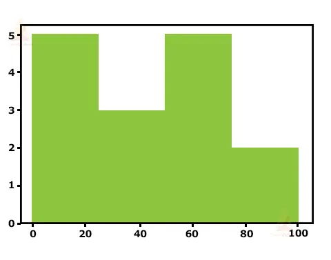
Output:
IMAGE
How to plot a KDE: Kernel Density Estimate
In terms of statistics, you have been using samples throughout this session. Regardless of whether the data is discrete or continuous, it is assumed that it came from a population whose real, precise distribution can be represented by a small number of characteristics.
A method for estimating the probability density function (PDF) of the random variable that “underlies” our sample is known as kernel density estimation (KDE). Data smoothing is accomplished using KDE.
Using plot.kde(), which is accessible for both Series and DataFrame objects and part of the Pandas package, you can make & overlay density graphs. However, let’s first create two separate data samples for comparison:
>>> means = 10, 20
>>> sdvs = 4, 2
>>> dts = pd.DataFrame(
...     np.random.normal(loc=means, scale=sdvs, size=(1000, 2)),
...     columns=['a', 'b'])
>>> dts.agg(['min', 'max', 'mean', 'std']).round(decimals=2)
If you look more closely at this function, you can see how closely it resembles the “real” PDF for a sample size of only 1000 data points, which is comparatively modest. The “analytical” distribution can be created using scipy.stats.norm in the example below (). This class instance includes the moments, descriptive functions, and statistical standard normal distribution. Its PDF is “accurate” in that it is precisely specified as the norm. pdf(x) is equal to exp(-x**2/2)/sqrt(2*pi).
Conclusion:
A frequency distribution table with continuous divisions that have been grouped is represented visually by a histogram. The area diagram consists of a set of rectangles, the areas of which are proportional to the frequency in the corresponding classes, and the foundations are equal to the distances between class limits.
Every rectangle is neighboring because the ground in such representations encompasses the intervals between class limits. For similar groups, rectangle altitudes are inversely correlated with comparable frequencies, and other classes are inversely connected with frequency densities. You learned what a histogram is in this post, along with how to make one in Python using Matplotlib, Pandas, and Seaborn. These libraries each have particular benefits and downsides. Seaborn is the way to go if you’re seeking a more stats-friendly alternative.