


In this tutorial, we will learn about scatter plot in Python. Let’s start!!
What is scatter plot in python?
One kind of graph that has dots plotted in it is called a scatter plot in Python. The data values are represented as dots on the plot. Using the matplotlib library, we will depict a scatter plot. Two sets of data are needed to create a scatter plot; one set of arrays represents the data on the x-axis, while the second set of arrays represents the data on the y-axis.
matplotlib.pyplot.scatter()
In most cases, scatter plots are used to examine the relationship between the variables. The connections between the dataset are represented by the dots in the graph. To create a scatter plot, we utilise the scatter() function from the matplotlib library. The scatter plot shows the relationship between the two variables and how it varies for one variable.
A comprehensive tool for creating static, animated, and interactive visualisations is offered by the Matplotlib toolbox for Python. It can produce scatter plots, 3-D plots, histograms, bar charts, pie charts, and line plots, among other types of Python graphs. We will learn everything there is to know about scatter plots from the matplotlib library.
The simple scatter plot, a close relative of the line plot, is another often-used plot style. Here, the points are each individually represented by a dot, circle, or another shape rather than by line segments.
Python Scatter() Function
Users can build scatter plots with the use of matplotlib’s scatter() function. The data are read and a scatter plot is produced once the scatter() function has been called.
Syntax of scatter plot
matplotlib.pyplot.scatter(x_axis_data, y_axis_data, s=None, c=None,marker=None, cmap=None, vmin=None, vmax=None, alpha=None, linewidths=None, edgecolors=None)
With the exception of x-axis data and y-axis data, every parameter in the syntax is optional. Their value will be set to none by default.
The following parameters are passed to the scatter() method:
- An array of x-axis data is called x-axis data.
- y-axis data: An array of y-axis information
- marker size s (can be scalar or array of size equal to the size of x or y)
- Color C of the Marker Color Sequence
- Marker-style writing
Let’s now construct a straightforward scatter using two arrays.
import matplotlib.pyplot as plt

x =[1, 3, 1, 9, 5, 55, 0, 5, 7, 24, 56, 8, 2]

y =[98, 87, 89, 86, 100, 88, 101, 89, 97, 72, 76, 87, 88]

plt.scatter(x, y, c ="blue")

# To show the plot
plt.show()
Output:
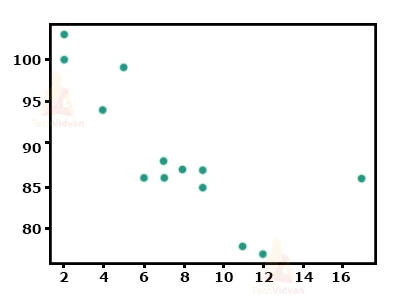

Here, the x-axis denotes the x, while the y-axis denotes y. The scores of each student are represented by each and every dot in the plot.
Randomly distributed data scatter plot
The dataset may include “n” different values in addition to randomly generated values. Let’s examine an example where 100 random values are distributed evenly among two arrays using a normal data distribution.
The mean will be set to 10 with a standard deviation of 2 for the first array in the dataset, and to 20 with a standard deviation of 5 for the second array.
Example-
#importing library
import matplotlib.pyplot as plt
#datasets
students_id = [1,2,3,4,5,6,7,8,9,10]
students_marks = [98,97,87,78,64,55,68,74,59,35]
#scatter plot for the dataset
plt.scatter(students_id, students_marks)
plt.show()
Output

Compare datasets using Plots in Python
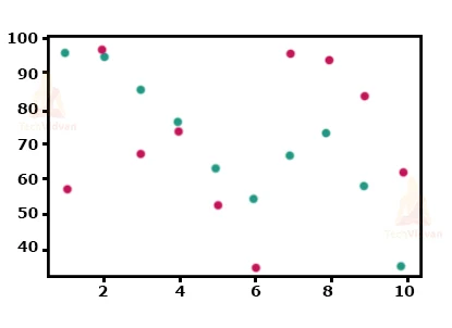
The graph of a scatter plot can potentially include more than one dataset. Let’s look at an example of code that compares two distinct datasets.
Example –
import matplotlib.pyplot as plt
import numpy as np
#Maths Marks
students_id = np.array([1,2,3,4,5,6,7,8,9,10])
students_marks = np.array([98,97,87,78,64,55,68,74,59,35])
plt.scatter(students_id, students_marks)

#science marks
students_id = np.array([1,2,3,4,5,6,7,8,9,10])
students_marks = np.array([58,99,68,75,53,35,98,96,85,63,])
plt.scatter(students_id, students_marks)

plt.show()
ColorMap in Python
The matplotlib library’s collection of colours is listed in the colour map. Every single hue has a distinct value ranging from 0 to 100.
How to use colormap in the scatter plot?
Given the value of the colormaps in the code, we can define the colormap using the keyword “viridis” since it is one of the built-in colormaps in the matplotlib package. “cmap” is a keyword parameter to specify the colormap.
Scatter plots in Dash
The best approach to create analytical Python programmes using Plotly figures is with Dash. Run pip instal dash, click “Download” to acquire the source code, then launch python app.py to launch the application below.
Scatter plots and Categorical Axes
Any kind of cartesian axis, such as linear, logarithmic, categorical, or date axes, can be used to create scatter plots.
Line plots on Date axes
Any sort of cartesian axis, such as linear, logarithmic, category, or date axes, can be used to create a line plot. Time-series charts are typically used to describe line plots on date axes.
When the associated data are either ISO-formatted date strings, a date pandas column, or a DateTime NumPy array, Plotly automatically sets the axis type to a date format.
Alpha
The transparency of the graph’s dots can also be changed by the user. We utilise the “alpha” option to denote transparency. Alpha can be between 0 and 1. The range 0 represents complete transparency, while the range 1 represents total opacity.
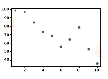
Example-
import matplotlib.pyplot as plt
import numpy as np
students_id = [1,2,3,4,5,6,7,8,9,10]
students_marks = [99,96,84,73,68,55,64,78,52,35]
sizes = np.array([10,20,30,40,50,60,70,80,90,100])

plt.scatter(students_id, students_marks, color = 'black', s=sizes, alpha = 0.4)

plt.show()
Shapes in scatter plot
The graph’s representation shape can be altered by the user. It shows up as a dot by default, but you can change it to a square, triangle, star, etc.
Conclusion
This is all about scatter plots in python. Hope