Flutter Project – To Do App
In our daily lives, we have to work on several tasks, whether it is picking up groceries, completing homework, or finishing a presentation for work. Sometimes, it is difficult to keep track of all the tasks, and some get missed. To help solve this problem, we will build a Flutter To-Do app to keep track of all the tasks.
In the Flutter To-Do App Project, we will keep track of all the tasks and their deadlines. We will also show how many tasks are done out of the total tasks and how many remain. We can also add a new task or delete a task if it is completed.
Let’s get started!
Prerequisites For Flutter To-Do App
Before starting work on building the app, you should have the below-mentioned required software on your computer:
(i) Flutter – Refer to the link for installing Flutter, depending on your operating system.
(ii) Android Studio—You can download Android Studio. The app must be run on an Android emulator.
(iii) Visual Studio Code – Although unnecessary, you can also build apps in Android Studio. However, in our case, we used Visual Studio Code as it is a good code editor.
Now that the setup is ready let’s get started!
Download Flutter To-Do App Project
Please download the source code of Flutter To-Do App Project: Flutter To-Do App Project Code.
Creating New Flutter Project
First, let’s create a new project in Flutter by doing the following steps:-
1. Go to the directory where you want to save the project using:-
cd $Project-directory-path
2. Then create a new project using the below command:-
flutter create to_do_app

Changes in pubsec.yaml file
To build the application, we would need the following library:-
intl – We will use this library to format the date in the required format to show when the news was published. The command mentioned below can be used to install the library:-
flutter pub add intl
Steps to Build Flutter To-Do App
1. Editing the Main File and Specifying the Theme for the App
Let’s start by creating the app’s main layout. In the main function, we are returning MaterialApp, which will add the app’s material design and basic styling. We are also specifying a theme for the app. Here, we have specified primaryColor, textTheme for various sizes of titles, and appBarTheme. In the home argument, we are returning the Scaffold widget with appBar, and in the body argument of the Scaffold, we are returning the HomePage widget, which we will create below in the article.
import 'package:flutter/material.dart';

import './home_page.dart';

void main() {
  runApp(MaterialApp(
      theme: ThemeData(
        primaryColor: const Color.fromARGB(221, 255, 174, 60),
        textTheme: const TextTheme(
          titleLarge: TextStyle(fontSize: 24, fontWeight: FontWeight.bold),
          titleMedium: TextStyle(fontSize: 20, fontWeight: FontWeight.w600),
          displayMedium: TextStyle(fontSize: 16, fontWeight: FontWeight.bold),
        ),
        appBarTheme: const AppBarTheme(
          backgroundColor: Color.fromARGB(
            221,
            234,
            150,
            33,
          ),
        ),
      ),
      home: Scaffold(
        appBar: AppBar(
          title: const Text('To-Do App (By TechVidvan)'),
        ),
        body: const HomePage(),
      )));
}
2. Creating Task Class
Here, we are creating a class called Task, which will store the details/parameters of a Task, such as its title, description, and whether it is completed or not, in a variable called is completed, date, and category.
We have also defined a getter function called the formattedDate, which will format the date in the required format. For this, we are using the method DateFormat, which we imported from the intl package.
import 'package:flutter/material.dart';
import 'package:intl/intl.dart';

var formatter = DateFormat.yMd();

enum Category { home, shopping, study, work, contact }

var categoryIcons = {
  Category.home: Icons.home,
  Category.shopping: Icons.shopping_cart,
  Category.study: Icons.menu_book_outlined,
  Category.work: Icons.work,
  Category.contact: Icons.contact_phone_outlined
};

class Task {
  String title;
  String description;
  bool isCompleted;
  DateTime date;
  Category category;

  Task(
      {required this.title,
      required this.description,
      required this.isCompleted,
      required this.date,
      required this.category});

  String get formattedDate {
    return formatter.format(date);
  }
}
3. Building the Home Page for the App
Let’s start building the HomePage of the app. Here, we have imported Task model, which we created above as well as some other custom widgets, which we will create in the next sections below.
HomePage is a Stateful Widget as the content of the page needs to be updated as the user enters new tasks
Here, we have defined variables like:-
a. _totalTasks – To keep track of the total number of tasks added by the user
b. _tasksCompleted – This shows the number of tasks that the user has completed
c. _tasksRemaining – This shows the tasks left or not completed by the user.
We have also defined a variable, ‘tasks, ‘ as a list to store user-added tasks.
We have also defined functions for the user interaction with the app. These are:-
a. addNewTask – This is used to add new Tasks to the list of ‘tasks’. It accepts the task as an argument of the function.
b. openModelSheet—It is used to show the ModalBottomSheet and add a new task. In the showModalBottomSheet, we have set the useSafeArea parameter to true. In the builder function, we are returning the NewTask widget to add a new task to the list, which we will create in the next step.
c. updateTasksCompletion – This function helps update the _totalTasks, _tasksCompleted, _tasksRemaining, which we created above when the user adds or deletes a task.
d. removeTask—It executes when the user deletes a task. It removes the task from the list of tasks and executes the updateTasksCompletion function. After that, it shows a SnackBar using which the user can Undo the deletion. In the content argument, it shows ‘Task Deleted’ using a Text widget, and in the action argument, it shows a SnackBarAction to undo the task deleted and add it again in the list.
We have also overridden the initState function so that the updateTasksCompletion function is also called when the app is built.
import 'package:flutter/material.dart';

import './models/task.dart';
import 'widgets/tasks_list.dart';
import './new_task.dart';

class HomePage extends StatefulWidget {
  const HomePage({super.key});
  @override
  State<HomePage> createState() {
    return _HomePageState();
  }
}

class _HomePageState extends State<HomePage> {
  var _totalTasks = 0;
  var _tasksCompleted = 0;
  var _tasksRemaining = 0;

  List<Task> tasks = [
    Task(
        title: 'Get Groceries',
        description:
            'Need to go to the market and buy milk, fruits and vegetables',
        isCompleted: false,
        date: DateTime.now(),
        category: Category.shopping),
    Task(
        title: 'Homework',
        description: 'Submit the problems of Math',
        isCompleted: false,
        date: DateTime.now(),
        category: Category.study)
  ];

  void addNewTask(Task task) {
    setState(() {
      tasks.add(task);
    });
  }

  void openModelSheet() {
    showModalBottomSheet(
        useSafeArea: true,
        isScrollControlled: true,
        context: context,
        builder: (ctx) {
          return NewTask(
              updateTotalTasksStatus: updateTasksCompletion,
              onAddTask: addNewTask);
        });
  }

  void updateTasksCompletion() {
    setState(() {
      _totalTasks = tasks.length;
      _tasksCompleted =
          tasks.where((element) => element.isCompleted == true).length;
      _tasksRemaining = _totalTasks - _tasksCompleted;
    });
  }

  void removeTask(Task task) {
    final taskIndex = tasks.indexOf(task);
    setState(() {
      tasks.remove(task);
      updateTasksCompletion();
    });
    ScaffoldMessenger.of(context).clearSnackBars();
    ScaffoldMessenger.of(context).showSnackBar(
      SnackBar(
        duration: const Duration(seconds: 3),
        content: const Text('Task Deleted!'),
        action: SnackBarAction(
            label: 'Undo',
            onPressed: () {
              setState(() {
                tasks.insert(taskIndex, task);
              });
              updateTasksCompletion();
            }),
      ),
    );
  }

  @override
  void initState() {
    super.initState();
    updateTasksCompletion();
  }
In the build function, we are returning the Column widget to show the content on the page. In the children, we have added a SizedBox to maintain a gap from the above for the content. We are using Text widget to show the totalTasks and using the style from the textTheme we defined in the main file. Below it, we show the tasksCompleted and tasksRemaining horizontally using the Row widget. We are adding a line after it using the Divider widget to separate the content.
After that, we return the tasks list using the TasksList widget, which we will create in the helper widgets section inside the Expanded widget. We are using the Spacer widget to take as much height as possible, and at the bottom of the screen, we are returning an Elevated Button showing text as ‘Add New Task’. openModelSheet function gets executed when the user presses the button, which shows a ModelBottomSheet through which the user can add a new task.
@override
  Widget build(BuildContext context) {
    return Column(
      children: [
        const SizedBox(
          height: 15,
        ),
        Text(
          'Total Tasks - $_totalTasks',
          style: Theme.of(context).textTheme.titleLarge,
        ),
        const SizedBox(
          height: 25,
        ),
        Row(
          children: [
            const Spacer(),
            Text(
              'Completed - $_tasksCompleted',
              style: Theme.of(context).textTheme.titleMedium,
            ),
            const SizedBox(
              width: 45,
            ),
            Text(
              'Remaining - $_tasksRemaining',
              style: Theme.of(context).textTheme.titleMedium,
            ),
            const Spacer()
          ],
        ),
        const SizedBox(
          height: 15,
        ),
        const Divider(
          thickness: 1,
          color: Colors.grey,
        ),
        Expanded(
          flex: 4,
          child: TasksList(
              onRemoveTask: removeTask,
              tasks: tasks,
              updateTaskStatus: updateTasksCompletion),
        ),
        const Spacer(),
        ElevatedButton(
          onPressed: openModelSheet,
          style: ElevatedButton.styleFrom(
            backgroundColor: Theme.of(context).primaryColor,
            padding: const EdgeInsets.symmetric(horizontal: 20, vertical: 12),
            shape: const RoundedRectangleBorder(
              borderRadius: BorderRadius.all(
                Radius.circular(10),
              ),
            ),
          ),
          child: Text(
            "Add New Task",
            style: Theme.of(context).textTheme.titleMedium,
          ),
        ),
        const SizedBox(
          height: 45,
        )
      ],
    );
  }
}
4. Creating New Task
Let’s build the widget for New Task, which shows when the user clicks the “Add New Task” button on the home page. It is a Statewide widget, as the page content needs to change as the user enters the task details.
Here, we accept the function updateTotalTasksStatus, onAddTask, which we created in the above step through the constructor function.
We have defined variables such as:-
a. _titleController – It is a TextEditingController that controls the title entered by the user.
b. _descriptionController – It is a TextEditingController that controls the description entered by the user.
c. _selectedDate – It stores the date chosen by the user.
d. _selectedCategory – It is the category for the task the user selects.
We have also created a few functions that we will be using here:-
a. _presentDayPicker—This is used to display the showDatePicker widget, from which the user can select a date. Here, the initialDate is set to the current date. As the user picks a date, the value of variable_selectedDate is changed to the picked date.
b. addNewTask—This function is used to add the new task created by the user to the list. It checks whether the details entered by the user, such as title or selectedDate, are valid. If they are, it adds the task to the list of tasks using the onAddTask, which we accepted through the constructor function. Otherwise, it shows an Alert dialog mentioning that the details entered by the user are invalid.
import 'package:flutter/material.dart';

import './models/task.dart';
import './widgets/custom_textfield.dart';

class NewTask extends StatefulWidget {
  const NewTask(
      {required this.updateTotalTasksStatus,
      required this.onAddTask,
      super.key});
  final Function(Task) onAddTask;
  final Function updateTotalTasksStatus;
  @override
  State<NewTask> createState() {
    return _NewTaskState();
  }
}

class _NewTaskState extends State<NewTask> {
  final _titleController = TextEditingController();
  final _descriptionController = TextEditingController();

  DateTime? _selectedDate;
  Category _selectedCategory = Category.work;

  void _presentDayPicker() async {
    var now = DateTime.now();
    final initialDate = DateTime(now.year - 1, now.month, now.day);
    var _pickedDate = await showDatePicker(
        context: context,
        initialDate: now,
        firstDate: initialDate,
        lastDate: now);
    setState(() {
      _selectedDate = _pickedDate;
    });
  }

  void addNewTask() {
    var isValidTitle = _titleController.text.isNotEmpty;

    if (isValidTitle && _selectedDate != null) {
      widget.onAddTask(Task(
          title: _titleController.text,
          description: _descriptionController.text,
          isCompleted: false,
          date: _selectedDate!,
          category: _selectedCategory));
      widget.updateTotalTasksStatus();
      Navigator.pop(context);
    } else {
      showDialog(
        context: context,
        builder: (context) {
          return AlertDialog(
            title: const Text('Invalid Input'),
            content: const Text(
                'Please make sure a valid title, date and category was enterd!'),
            actions: [
              TextButton(
                  onPressed: () {
                    Navigator.pop(context);
                  },
                  child: const Text('Cancel'))
            ],
          );
        },
      );
    }
  }
In the build function, we have defined a variable, keyboardSpace, to store the height of the keyboard that pops up when a user tries to enter any detail. We have also defined categoryDropDown, which is a widget that shows the Dropdown Button from which the user can select the category for the task.
Finally, in the build function, we are returning a Column widget inside the SingleChildScrollView widget. In the column widget, we show the task’s title using a custom field, which we will build in the next step. Below it, we display the categoryDropDown widget we just created and an IconButton, which executes the _presentDayPicker function through which the user can select the date. Below it, we show a TextField through which the user can enter the note/description about the task.
Finally, at the bottom, we are showing an Elevated button, which, when pressed, executes the addNewTask function and adds the newly created task to the list.
@override
  Widget build(BuildContext context) {
    final keyboardSpace = MediaQuery.of(context).viewInsets.bottom;
    Widget categoryDropDown = Container(
      width: 150,
      decoration: BoxDecoration(
          border: Border.all(color: Colors.grey),
          borderRadius: BorderRadius.circular(5)),
      child: DropdownButton(
        padding: const EdgeInsets.fromLTRB(8, 0, 10, 0),
        value: _selectedCategory,
        items: Category.values
            .map(
              (category) => DropdownMenuItem(
                value: category,
                child: Text(
                  category.name.toUpperCase(),
                ),
              ),
            )
            .toList(),
        onChanged: (value) {
          setState(
            () {
              if (value == null) {
                return;
              }
              setState(
                () {
                  _selectedCategory = value;
                },
              );
            },
          );
        },
      ),
    );
    return SingleChildScrollView(
      child: Padding(
        padding: EdgeInsets.fromLTRB(16, 48, 16, keyboardSpace + 16),
        child: Column(
          children: [
            CustomTextField(
              hintText: 'Title',
              title: 'Title',
              maxLines: 1,
              controller: _titleController,
            ),
            const SizedBox(
              height: 15,
            ),
            Row(
              children: [
                categoryDropDown,
                const SizedBox(
                  width: 50,
                ),
                Expanded(
                  child: Padding(
                    padding: const EdgeInsets.all(8),
                    child: Row(
                      children: [
                        Text(
                          _selectedDate == null
                              ? 'No Date Selected!'
                              : formatter.format(_selectedDate!),
                        ),
                        IconButton(
                            onPressed: _presentDayPicker,
                            icon: const Icon(Icons.calendar_month)),
                      ],
                    ),
                  ),
                ),
              ],
            ),
            const SizedBox(
              height: 25,
            ),
            CustomTextField(
              hintText: 'Notes',
              title: 'Notes',
              maxLines: 6,
              controller: _descriptionController,
            ),
            const SizedBox(
              height: 20,
            ),
            ElevatedButton(
              style: ElevatedButton.styleFrom(
                  backgroundColor: Theme.of(context).primaryColor),
              onPressed: addNewTask,
              child: Padding(
                padding:
                    const EdgeInsets.symmetric(horizontal: 20, vertical: 8),
                child: Text(
                  'Save',
                  style: Theme.of(context).textTheme.titleMedium,
                ),
              ),
            ),
            const SizedBox(
              height: 10,
            )
          ],
        ),
      ),
    );
  }
}
5. Helper Widgets Used in the App
A. Building Task Card
This widget shows individual tasks on the home screen. It is a Stateful Widget, as the user can mark it completed when it is done.
Here, we accept the function updateTaskStatus, which updates the variables when the user marks the task completed, and currentTask, which is the Task to be displayed on the card, through the constructor function.
In the build function, we are returning the Card widget to give it a nice look. Inside it, we are using the Padding widget to add padding to the content. We are returning the Row widget as the child to the Padding widget. Inside the Row widget, we are returning an Icon for the task category, a Column widget to show the title and date of the task and a Checkbox through which the user can mark the task as completed or remaining.
import 'package:flutter/material.dart';
import 'package:to_do_app/models/task.dart';

class TaskCard extends StatefulWidget {
  const TaskCard(
      {required this.updateTaskStatus, required this.currentTask, super.key});

  final Task currentTask;
  final Function updateTaskStatus;

  @override
  State<TaskCard> createState() => _TaskCardState();
}

class _TaskCardState extends State<TaskCard> {
  @override
  Widget build(BuildContext context) {
    return Card(
      color: Theme.of(context).primaryColor,
      child: Padding(
        padding: const EdgeInsets.symmetric(horizontal: 20, vertical: 15),
        child: Row(
          children: [
            Icon(
              categoryIcons[widget.currentTask.category],
              color: Color.fromARGB(255, 235, 232, 232),
            ),
            const SizedBox(
              width: 10,
            ),
            Column(
              crossAxisAlignment: CrossAxisAlignment.start,
              children: [
                Text(
                  widget.currentTask.title,
                  style: Theme.of(context).textTheme.displayMedium,
                ),
                const SizedBox(
                  height: 10,
                ),
                Text(widget.currentTask.formattedDate)
              ],
            ),
            const Spacer(),
            Checkbox(
              value: widget.currentTask.isCompleted,
              onChanged: (value) {
                setState(() {
                  widget.currentTask.isCompleted = value!;
                });
                widget.updateTaskStatus();
              },
            ),
          ],
        ),
      ),
    );
  }
}
B. Creating a Tasks List
This widget shows the list of tasks on the home page. Here, we are importing the Task model we created above and the TaskCard widget. It is a Stateful widget, as the number of tasks can vary, and the list needs to be updated.
In the builder function, we are returning the ListView.builder, where the itemCount parameter is set to the number of tasks. Through the itemBuilder parameter, we are returning the TaskCard we created above wrapped around the Dismissible widget so that the user can swipe to delete the task.
import 'package:flutter/material.dart';

import '../models/task.dart';
import 'task_card.dart';

class TasksList extends StatefulWidget {
  const TasksList(
      {required this.onRemoveTask,
      required this.updateTaskStatus,
      required this.tasks,
      super.key});
  final List<Task> tasks;
  final Function updateTaskStatus;
  final Function(Task) onRemoveTask;

  @override
  State<TasksList> createState() {
    return _TasksListState();
  }
}

class _TasksListState extends State<TasksList> {
  @override
  Widget build(BuildContext context) {
    return ListView.builder(
      itemCount: widget.tasks.length,
      itemBuilder: (ctx, index) {
        return Container(
          margin: const EdgeInsets.symmetric(horizontal: 30, vertical: 5),
          child: Dismissible(
            key: ValueKey(widget.tasks[index]),
            onDismissed: (direction) {
              widget.onRemoveTask(widget.tasks[index]);
            },
            child: TaskCard(
                updateTaskStatus: widget.updateTaskStatus,
                currentTask: widget.tasks[index]),
          ),
        );
      },
    );
  }
}
C. Building Custom TextField Widget
Here, we are creating a custom TextField. We accept controller, hintText, title, maxLines, suffixIcon, and readOnly, which are the parameters for TextField through the constructor function.
In the build function, we are returning a Column widget, inside which there is a Text widget showing the title and a TextField with the parameters we accepted in the constructor function. Both of these are separated using a SizedBox.
import 'package:flutter/material.dart';

class CustomTextField extends StatelessWidget {
  const CustomTextField({
    super.key,
    this.controller,
    required this.hintText,
    required this.title,
    this.maxLines,
    this.suffixIcon,
    this.readOnly = false,
  });
  final TextEditingController? controller;
  final String hintText;
  final String title;
  final int? maxLines;
  final Widget? suffixIcon;
  final bool readOnly;

  @override
  Widget build(BuildContext context) {
    return Column(
      crossAxisAlignment: CrossAxisAlignment.stretch,
      children: [
        Text(
          title,
          style: Theme.of(context).textTheme.titleMedium,
        ),
        const SizedBox(height: 10),
        TextField(
          readOnly: readOnly,
          onTapOutside: (event) {
            FocusManager.instance.primaryFocus?.unfocus();
          },
          autocorrect: false,
          controller: controller,
          decoration: InputDecoration(
            border: const OutlineInputBorder(),
            focusedBorder: OutlineInputBorder(
              borderSide:
                  BorderSide(color: Theme.of(context).primaryColor, width: 2),
            ),
            hintText: hintText,
            suffixIcon: suffixIcon,
          ),
          maxLines: maxLines,
        ),
      ],
    );
  }
}
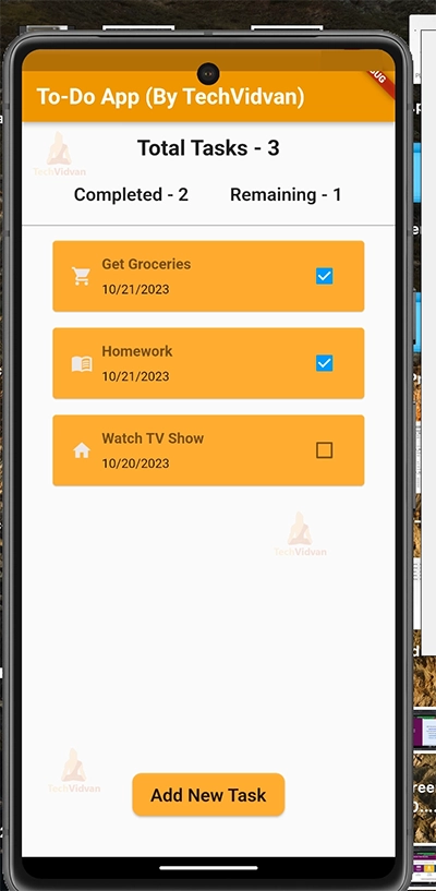
Flutter To-Do App Output


Conclusion
Finally, you have your Flutter To-Do App Project ready! Now, you can easily manage your tasks. Through this Flutter To-Do App Project, we learned about many exciting widgets. We used the CheckBox widget to oversee the completion of tasks, the DropDown button to select a category, the Dismissible widget to delete functions with a swipe and much more. We also saw how to dynamically update the variables shown on the home page, like total tasks, completed tasks, etc., as the user adds or deletes a task.
I hope you enjoyed working on this project!
Thank you for reading! Keep Learning Flutter!