NumPy Matpotlib – Data Visualization Plot
If you’re looking to create stunning visualizations and plots in Python, Matplotlib is your go-to library. Whether you’re a data scientist, engineer, or just someone who wants to visualize data, Matplotlib provides a powerful toolset.
In this beginner-friendly guide, we’ll explore the basics of Matplotlib, its integration with NumPy, and how to create various types of plots.
What is Matplotlib?
Matplotlib is a Python library that makes it easy to create graphs and charts. It can be used to visualize data in many different ways, such as line plots, scatter plots, bar plots, and histograms. Matplotlib also supports 2D and 3D plots. It was originally developed by John D. Hunter and is currently maintained by Michael Droettboom. Matplotlib is an open-source alternative to MATLAB and can be integrated seamlessly with libraries like NumPy, PyQt, and wxPython.
Creating Your First Plot
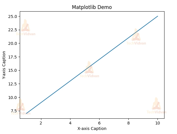
Let’s start with a simple example. Suppose you want to plot the equation y = 2x + 5. Here’s how you can do it using Matplotlib and NumPy:
import numpy as np
from matplotlib import pyplot as plt

x = np.arange(1, 11)  # Create an array from 1 to 10
y = 2 * x + 5

plt.title("Matplotlib Demo")
plt.xlabel("X-axis Caption")
plt.ylabel("Y-axis Caption")
plt.plot(x, y)  # Plot the data points
plt.show()       # Display the plot
In this code:
- We import NumPy as np for numerical operations.
- We create an array x using np.arange() to represent the x-axis values from 1 to 10.
- We calculate the corresponding y-axis values and store them in the y array.
- We set the title and labels for the x and y axes.
- We use plt.plot() to create a line plot with x and y as data points.
- Finally, we use plt.show() to display the plot.
- Running this code will generate a plot of a straight line with the equation y = 2x + 5.
Output:
Customizing Your Plot
Matplotlib offers extensive customization options to make your plots visually appealing. You can change line styles, markers, colors, and more. Here are some common customization options:
| SR.NO. | CHARACTER & DESCRIPTION |
| 1 | -‘
Solid line style |
| 2 | –‘
Dashed line style |
| 3 | -.’
Dash-dot line style |
| 4 | :’
Dotted line style |
| 5 | .’ Point marker |
| 6 | ,’
Pixel marker |
| 7 | o’
Circle marker |
| 8 | v’
Triangle_down marker |
| 9 | ^’
Triangle_up marker |
| 10 | <‘
Triangle_left marker |
| 11 | >’ Triangle_right marker |
| 12 | 1′
Tri_down marker |
| 13 | 2′
Tri_up marker |
| 14 | 3′
Tri_left marker |
| 15 | 4′
Tri_right marker |
| 16 | s’
Square marker |
| 17 | p’ Pentagon marker |
| 18 | *’
Star marker |
| 19 | h’
Hexagon1 marker |
| 20 | H’
Hexagon2 marker |
| 21 | +’
Plus marker |
| 22 | x’
X marker |
| 23 | D’ Diamond marker |
| 24 | d’
Thin_diamond marker |
| 25 | |’
Vline marker |
| 26 | _’
Hline marker |
| CHARACTER | COLOR |
| b’ | Blue |
| g’ | Green |
| r’ | Red |
| c’ | Cyan |
| m’ | Magenta |
| y’ | Yellow |
| k’ | Black |
| w’ | White |
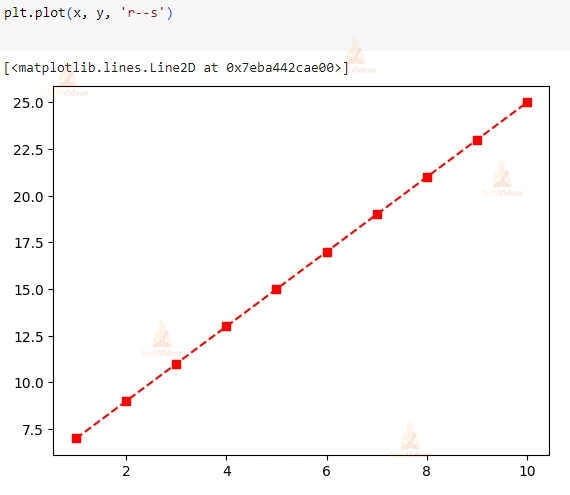
You can combine these options to create unique plots. For example, to plot a red dashed line with square markers, you can modify the plt.plot() line as follows:
plt.plot(x, y, 'r--s')
Output:
Now, let’s explore more types of plots you can create with Matplotlib.
Sine Wave Plot
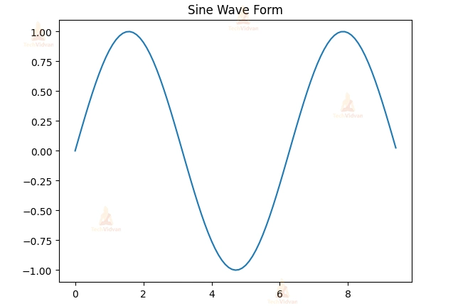
The following script produces a sine wave plot using Matplotlib:
import numpy as np
import matplotlib.pyplot as plt

# Compute the x and y coordinates for points on a sine curve
x = np.arange(0, 3 * np.pi, 0.1)
y = np.sin(x)

plt.title("Sine Wave Form")
plt.plot(x, y)
plt.show()
Output:
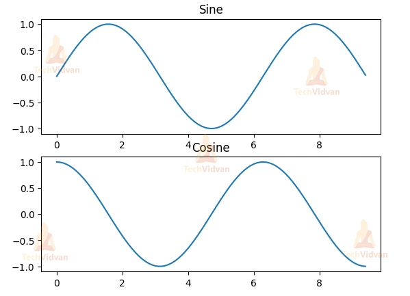
Subplots
Matplotlib allows you to create multiple plots within the same figure using the subplot() function. This can be useful for comparing different data sets or for showing different aspects of the same data set.
The following script plots sine and cosine values side by side using the subplot() function:
import numpy as np
import matplotlib.pyplot as plt

# Compute the x and y coordinates for points on sine and cosine curves
x = np.arange(0, 3 * np.pi, 0.1)
y_sin = np.sin(x)
y_cos = np.cos(x)

# Set up a subplot grid with 2 rows and 1 column,
# and set the first subplot as active.
plt.subplot(2, 1, 1)

# Make the first plot (Sine)
plt.plot(x, y_sin)
plt.title('Sine')

# Set the second subplot as active, and make the second plot (Cosine).
plt.subplot(2, 1, 2)
plt.plot(x, y_cos)
plt.title('Cosine')

# Show the figure with both subplots.
plt.show()
Here, we create a grid of subplots with 2 rows and 1 column. We then plot the sine and cosine curves in separate subplots.
Output:
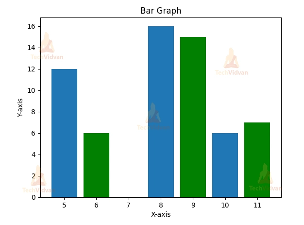
Bar Graphs
Matplotlib’s pyplot submodule provides the bar() function to generate bar graphs. In the following example, we create a bar graph with two sets of x and y arrays:
from matplotlib import pyplot as plt
x = [5, 8, 10]
y = [12, 16, 6]
x2 = [6, 9, 11]
y2 = [6, 15, 7]
plt.bar(x, y, align='center')
plt.bar(x2, y2, color='g', align='center')
plt.title('Bar Graph')
plt.ylabel('Y-axis')
plt.xlabel('X-axis')
plt.show()
Running this code will produce a bar graph with two sets of bars, one in the default color and the other in green, demonstrating how to customize your bar graphs.
Output:
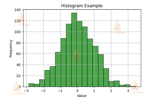
Histogram
The following code snippet visualizes the distribution of the data with 20 bins and displays it in green color.
import numpy as np
import matplotlib.pyplot as plt

# Sample data for histogram
data_histogram = np.random.randn(1000)

# Create a histogram
plt.figure(figsize=(8, 6))
plt.hist(data_histogram, bins=20, color='green', alpha=0.7, edgecolor='black')
plt.title('Histogram Example')
plt.xlabel('Value')
plt.ylabel('Frequency')
plt.grid(True)

# Display the histogram
plt.show()
Output:
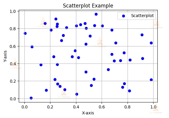
Scatterplot
The following code is an example of creating Scatter Plots using Matplotlib
import numpy as np
import matplotlib.pyplot as plt

# Sample data for scatterplot
x_scatter = np.random.rand(50)
y_scatter = np.random.rand(50)

# Create a scatterplot
plt.figure(figsize=(8, 6))
plt.scatter(x_scatter, y_scatter, color='blue', label='Scatterplot')
plt.title('Scatterplot Example')
plt.xlabel('X-axis')
plt.ylabel('Y-axis')
plt.legend()
plt.grid(True)

# Display the scatterplot
plt.show()
Output:
Conclusion
NumPy and Matplotlib are two of the most popular Python libraries for numerical computing and data visualization. By using these two libraries together, you can efficiently perform complex calculations and create informative and visually appealing plots.
In this blog post, we covered some of the most commonly used features of NumPy and Matplotlib. With NumPy and Matplotlib, you have the power to perform complex numerical computations and create informative and visually appealing plots. We encourage you to explore these libraries and use them to solve your own data science challenges. Happy Coding!