Graphical Data Analysis in R – Types and Examples
R is said to be the best platform for data visualization and graphical data analysis. It has a plethora of functions and commands needed to plot any kind of graph in any configuration for any kind of data. In this R Tutorial, we will learn about graphical data analysis in R.
We shall take a look at the different kinds of graphs R can plot with its base package. Then we will study the capabilities of the ggplot2 package. This is going to be an exciting chapter in TechVidvan’s R tutorial series. So let’s get started.
Graphical Data Analysis in R
R is believed to be the best at data visualization for good reason. R base packages come with functions like the hist() function, the boxplot() function, the barplot() function, etc. that can render a single type of graph. They also include the incredible plot() function that can render multiple kinds of graphs depending on the input arguments.
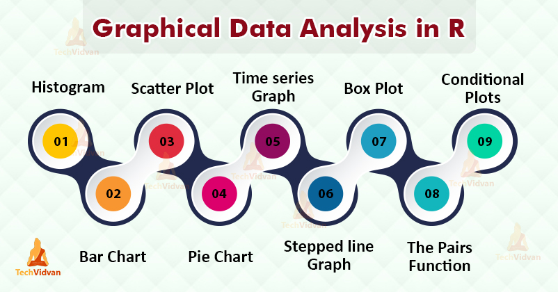
Let us take a look at the various types of graphs one-by-one:
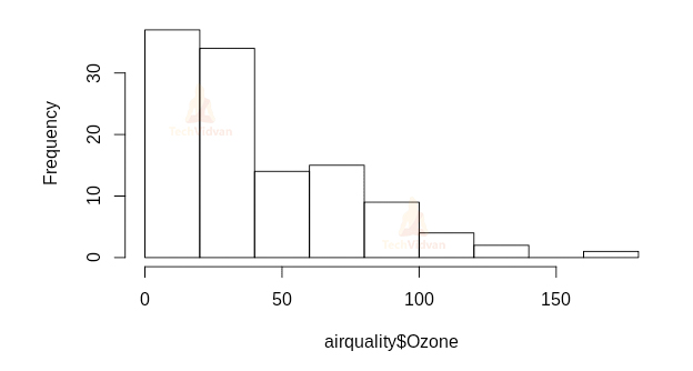
1. Histogram in R
Histograms are a means to show frequency distribution graphically. It shows the spread and shape of continuous data. We can plot a histogram in R by using the hist() function.
hist(airquality$Ozone)
Output:
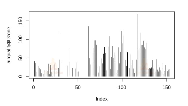
We can also use the plot() function to make a histogram by setting the type argument to h. This gives us a histogram like a high-density vertical line plot.
plot(airquality$Ozone, type=”h”)
Output:
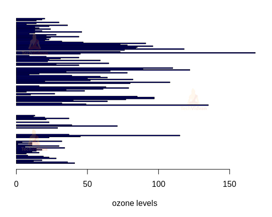
2. Bar chart in R
Bar charts show categorical data in the form of rectangular bars. The barplot() function can be used to plot a bar-chart in R.
barplot(
     airquality$Ozone,
     main="Ozone concentration in air",
     xlab='ozone levels',
     col='blue',
     horiz=TRUE)
Output:
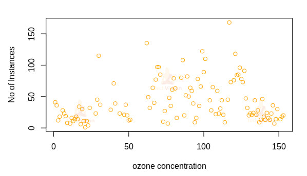
3. Scatter Plot in R
Scatterplots usually show two variables in a 2D cartesian plane. They are the default for the plot() function.
plot(
  airquality$Ozone,
  xlab='ozone concentration',
  ylab='No of Instances',
  main='Ozone levels in NY city',
  col='orange')
Output:
4. Pie chart in R
Pie charts show the percentage distribution of a single variable in the form of parts of a circle. We can make pie charts in R by using the pie() function.
pie.data <- c(0.3,0.25,0.12,0.23,0.06,0.04)
names(pie.data) <- c(letters[1:6])
pie(pie.data, col=rainbow(6))
Output:

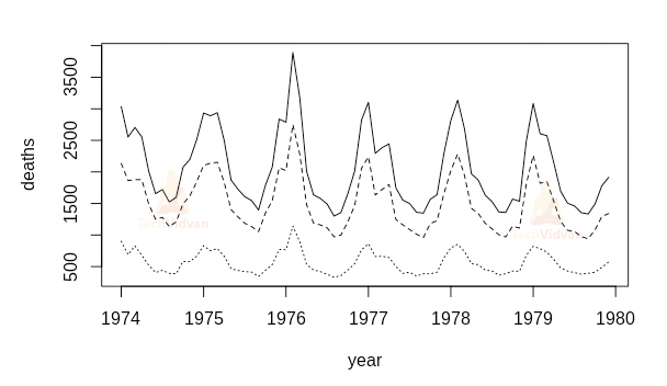
5. Time Series Graph in R
Time-series graphs are line graphs that show repeated measurements taken over time. Time-series graphs can be rendered in R using the ts.plot() function.
ts.plot(ldeaths,
        mdeaths,
        fdeaths,
        gpars=list(xlab="year",
                   ylab="deaths",
                   lty=c(1:3)))
Output:
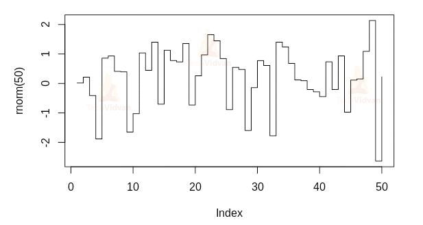
6. Stepped line graph in R
The stepped line graph is like a line graph with steps between data points. These are very useful to show changes in a measure at irregular intervals. We can make a stepped line graph in R using the plot() function and setting the type argument as s.
plot(rnorm(50),type='s')
Output:
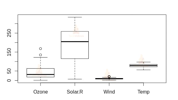
7. Box plot in R
Box plots show groups of numerical data through quartiles. They show important milestones of the data such as the minimum value, the first quartile, the median, the third quartile, and the maximum value. We can make a box plot by using the boxplot() function of R.
boxplot(airquality[,1:4],main="Air quality in NY city")
Output:
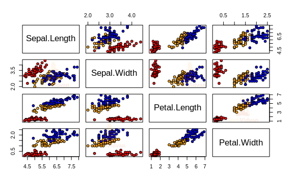
8. Pairs function in R
The pairs() function returns a matrix of multiple scatter plots. It is very useful when the number of variables is more than two. This function renders multiple scatter plots of every possible pair of the input variables. For example:
pairs(iris[1:4],
      main = "Anderson's Iris Data -- 3 species",
      pch = 21,
      bg = c("red", "orange", "blue")
      [unclass(iris$Species)])
Output:
9. Conditional plots in R
Conditional plots or coplots are plots of two variables conditional to a third variable. In R, the coplot() function can be used to render conditional plots.
Index <- seq(length = nrow(warpbreaks))
coplot(breaks ~ Index | wool * tension,
       data = warpbreaks,
       col = "blue",
       bg = "cyan",
       pch = 21,
       bar.bg = c(fac = "light blue"))
Output:

10. ggplot2 Package in R
Ggplot2 is probably the most powerful graphics package in R. It offers a lot of customization for the plots. The syntax of the ggplot2 package is slightly different from the base graphics package. Let us take a look at that:
1. A simple scatter plot with the ggplot2 package
library(ggplot2)
ggplot(midwest, aes(x=area,y=poptotal))+geom_point()
Output:
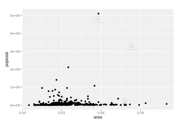
The geom_point() command is called a layer. The ggplot2 package has many such geom layers. Adding a layer enhances the graph in some ways.
2. Adding a smoothing layer to the plot
ggplot(midwest, aes(x=area,y=poptotal))+geom_point()+geom_smooth(method = "lm")
Output:
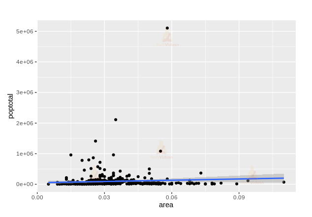
The geom_smooth() layer adds a smoothing layer to the plot
3. Adjusting the X and Y axis limit in the plot
ggplot(midwest, aes(x=area,y=poptotal))+geom_point()+geom_smooth(method = "lm")+xlim(c(0,0.1))+ylim(c(0,1000000))
Output:
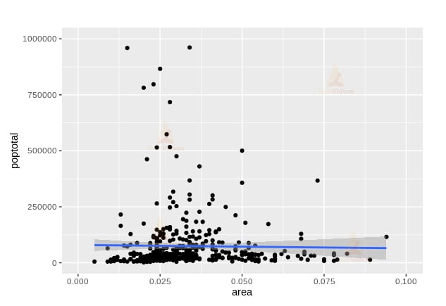
The xlim() and ylim() commands limit the range of the X and Y axis, which produces a zooming effect.
4. Changing the titles and axis labels of the plot
ggplot(midwest, aes(x=area,y=poptotal))+geom_point()+geom_smooth(method = "lm")+xlim(c(0,0.1))+ylim(c(0,1000000))+ labs(title="Area Vs Population", subtitle="From midwest dataset", y="Population", x="Area", caption="Midwest Demographics")
Output:
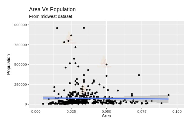
The ggtitle() command is another alternative to the labs() function
5. Changing the color and size of the points
ggplot(midwest, aes(x=area,y=poptotal))+geom_point(col="blue",size=3)+geom_smooth(method = "lm",col="red")+xlim(c(0,0.1))+ylim(c(0,1000000))+ labs(title="Area Vs Population", subtitle="From midwest dataset", y="Population", x="Area", caption="Midwest Demographics")
Output:
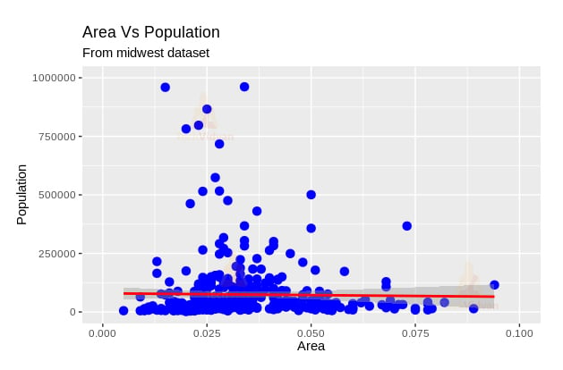
Modifying the aesthetics of the graphs is very easy with the ggplot2 package.
6. Varying the color of the point according to another variable
ggplot(midwest, aes(x=area,y=poptotal))+geom_point(aes(col=state),size=3)+geom_smooth(method = "lm",col="red")+xlim(c(0,0.1))+ylim(c(0,1000000))+ labs(title="Area Vs Population", subtitle="From midwest dataset", y="Population", x="Area", caption="Midwest Demographics")
Output:
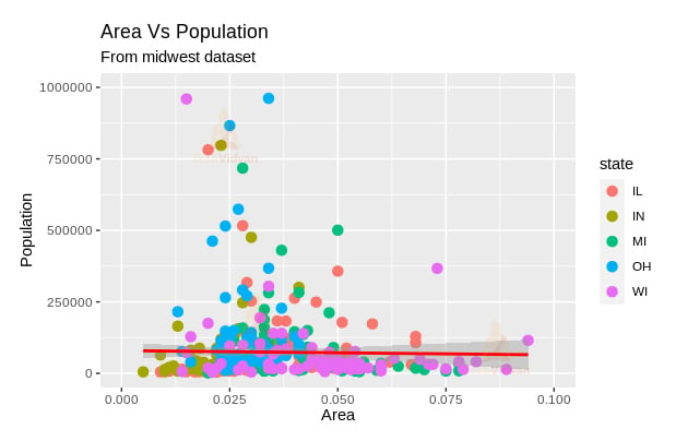
Varying the color like this enables the graph to convey even more information than before.
Summary
R is the foremost platform for data visualization. Out of all the data analysis data-science related tools out there, it is the best when it comes to the graphical representation of data. In this chapter of TechVidvan’s R tutorial series, we learn about the various graphs and plots that are possible to make through Graphical data Analysis in R. We looked at the functions and commands that produce these graphs. We, then, studied the gplot2 package and its various layers that add precision, details, and customizability to the graphs.