Lattice Package in R with Functions and Graphs
Lattice is a powerful and elegant data visualization package for R programming, with an emphasis on multivariate data. It is inspired by trellis graphics. In this article of TechVidvan’s R tutorial series, we are going to learn about the lattice package in R. We will study the functions and commands in the lattice package. We shall also look at the graphical capabilities of the package. So, let’s go!

Lattice Package in R
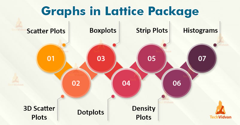
The lattice package is a graphics and data visualization package inspired by the trellis graphics package. The main focus of the package is multivariate data. It has a wide variety of functions that enable it to create basic plots of the base R package as well as enhance on them. Let us start looking at all the functions and graphs in the lattice package, one-by-one.
1. Scatter Plots in the Lattice Package
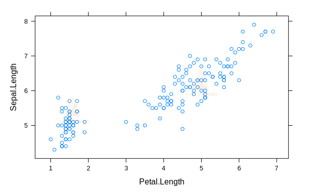
The xyplot() function can be used to create a scatter plot in R using the lattice package. The iris dataset is perfectly suited for this example.
library(lattice)
xyplot(Sepal.Length ~ Petal.Length,
       data = iris)
Output:
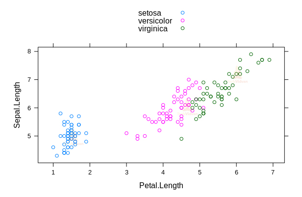
We can color the points of the scatter plot based on the categories.
xyplot(Sepal.Length ~ Petal.Length,
       data = iris,
       group = Species,
       auto.key = TRUE)
Output:
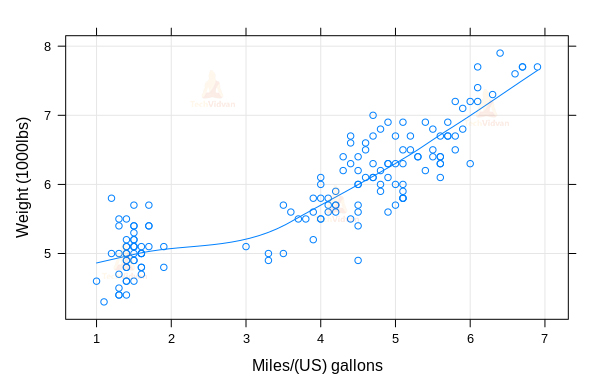
We can change the x and y labels and also add smoothing lines to the plot using the arguments in the xyplot() function.
xyplot(Sepal.Length ~ Petal.Length,
       data = iris,
       type = c("p", "g", "smooth"),
       xlab = "Miles/(US) gallons",
       ylab = "Weight (1000lbs)")
Output:
We can also create plots in multiple panels based on groups.
xyplot(Sepal.Length ~ Petal.Length | Species,
       group = Species,
       data = iris,
       type = c("p", "smooth"),
       scales = "free")
Output:

2. 3D scatter plots
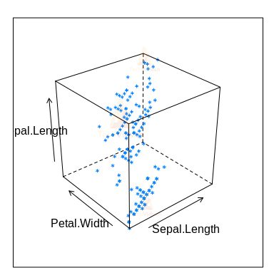
Using the cloud() function, we can create a 3D scatter plot. We can use the iris dataset for this example.
cloud(Sepal.Length ~ Sepal.Length*Petal.Width,
      data = iris)
Output:
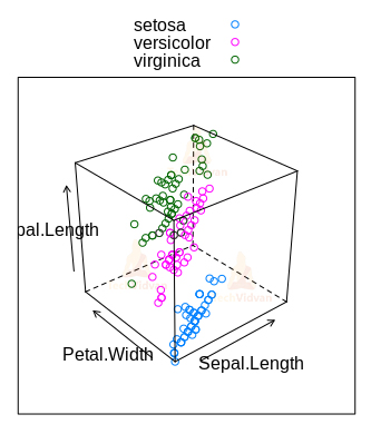
We can use the group argument to color the point based on groups, similarly to the xyplot() function.
cloud(Sepal.Length ~ Sepal.Length*Petal.Width,
      data = iris,
      group = Species,
      auto.key = TRUE)
Output:
3. Boxplots in Lattice Package in R
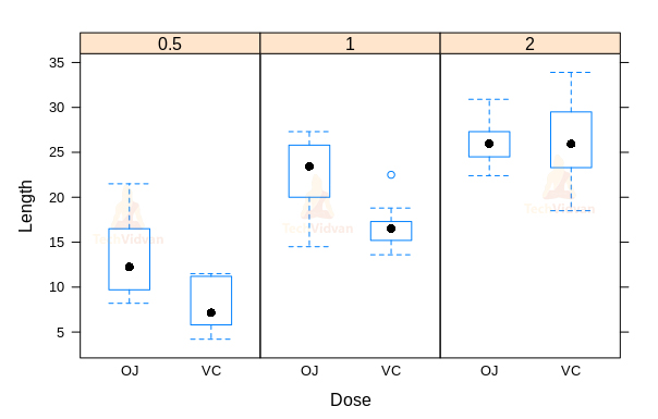
The lattice package provides a bwplot() function that can be used to create a box plot. We will be using the ToothGrowth data set for this example.
ToothGrowth$dose <- as.factor(ToothGrowth$dose)
bwplot(len ~ dose, data = ToothGrowth,
       xlab = "Dose",
       ylab = "Length")
Output:

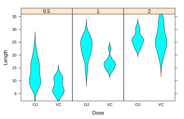
Using the panel argument of bwplot() function, we can make a violin plot as well.
bwplot(len ~ dose, data = ToothGrowth,
           xlab = "Dose",
           ylab = "Length",
           panel = panel.violin)
Output:

We can also create multiple plots based on the groups.
bwplot(len ~ supp|dose,
       data = ToothGrowth,
       layout = c(3,1),
       xlab = "Dose",
       ylab = "Length")
Output:
bwplot(len ~ supp|dose,
       data = ToothGrowth,
       layout = c(3,1),
       xlab = "Dose",
       ylab = "Length",
       panel = panel.violin)
Output:
4. Dotplots in Lattice Package in R
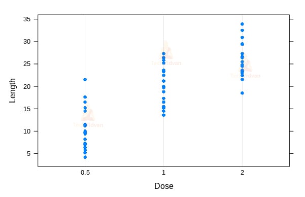
The R dotplot() function enables us to create dot plots in R. We will again use the ToothGrowth dataset for this example.
dotplot(len ~ dose,
        data = ToothGrowth,
        xlab = "Dose",
        ylab = "Length")
Output:
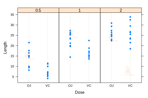
dotplot(len ~ supp|dose,
        data = ToothGrowth,
        layout = c(3,1),
        xlab = "Dose",
        ylab = "Length")
Output:
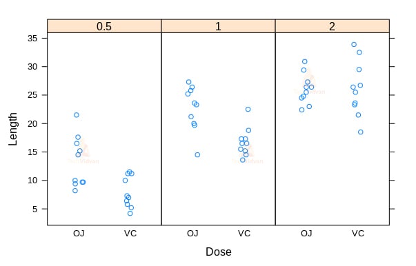
5. Strip Plots in the Lattice Package
Strip plots can be created in R using the stripplot() function of the lattice package. We will be using the same ToothGrowth dataset.
stripplot(len ~ dose,
          data = ToothGrowth,
          jitter.data = TRUE,
          pch = 19,
          xlab = "Dose",
          ylab = "Length")
Output:

stripplot(len ~ supp|dose,
          data = ToothGrowth,
          layout = c(3,1),
          xlab = "Dose",
          ylab = "Length",
          jitter.data = TRUE)
Output:
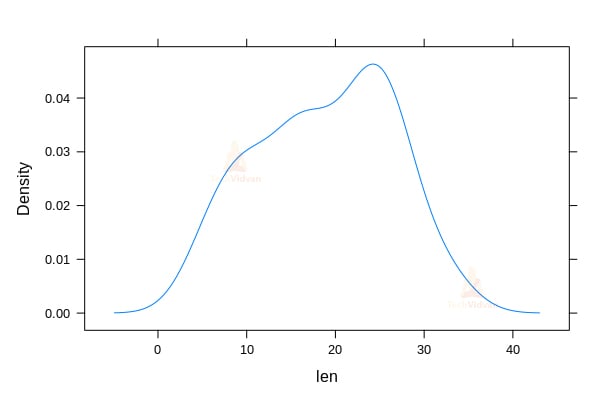
6. Density Plots in the Lattice Package
We can create density plots in R using the densityplot() function of the lattice package.
densityplot(~ len, data = ToothGrowth,
                  plot.points = FALSE)
Output:
densityplot(~ len, data = ToothGrowth,
            plot.points = FALSE,
            groups = dose,
            auto.key = TRUE)
Output:

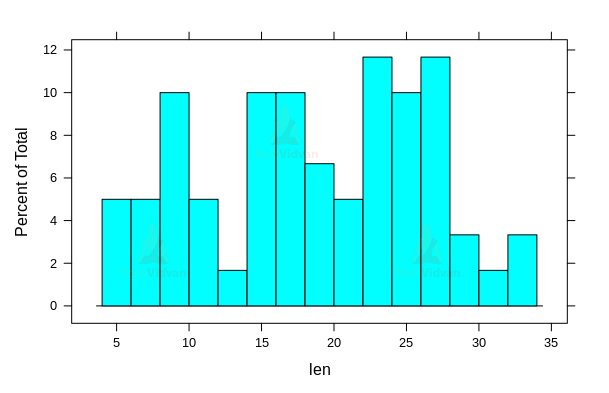
7. Histograms in the Lattice Package
To create a histogram using the lattice package, we can use the histogram() function.
histogram(~ len, data = ToothGrowth,
          breaks = 20)
Output:
Summary
In this chapter of TechVidvan’s R tutorial series, we learned about the Lattice Package in R. We studied the functions of the R Lattice package that create the various graphs and plots. We looked at how to create graphs like scatter plots, 3D scatter plots, boxplots, dotplots, stripplots, density plots, and histograms.
Do share your feedback in the comment section.