Introduction to Matplotlib – Python Plotting Library
This Matplotlib tutorial will help you get your basics right on using Python for Data Visualization. This tutorial will help you learn about plots, kinds of plot, subplots, labels, and much more.
Visual learning has become an integral part of today’s learning process.
Why not? Human retention is increased by 30% through pictorial representation. Our mind loves to process characters, colors, lines, boundaries, etc. right hemisphere of the brain is pretty funky. The left-brain hemisphere gets a benefit from this when we want to know about the python plotting library– Matplotlib.
Let’s find out.
Matplotlib Introduction
Matplotlib is the most extensively used Data Visualization library in Python programming. You can generate plots, graphs, bar graphs, scatter graphs, histograms, arrays etc. in a 2D form easily.
Let’s START!
1. Importing the Library
To run the matplotlib library in our IDE environment, it is needed to be imported under the alias plt.
[ For Beginners, this library has to be Installed first under File > Settings > + sign on the top right of the window in Pycharm].
CODE SNIPPET:
import matplotlib.pyplot as plt
- plt becomes handy in the further code so as to type less and reference the library again and again.
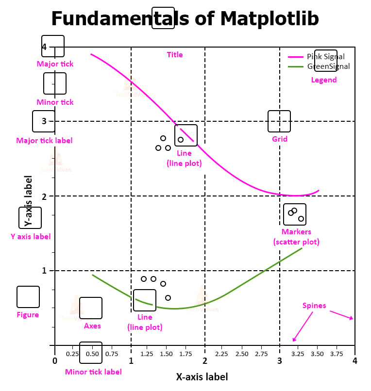
2. Few Important Functions
a. Plot() function: Used to plot the points or data on the graph.
b. Label([ ]) function: Used to label the axes ( x and y ) on the graph.
c. Title() function: Used to give heading to the graph.
d. Legend() function: Used to mention the data depicted through the graph.
e. Show() function: Used to display the generated graph.
3. Implementing Various Kinds of Graphs
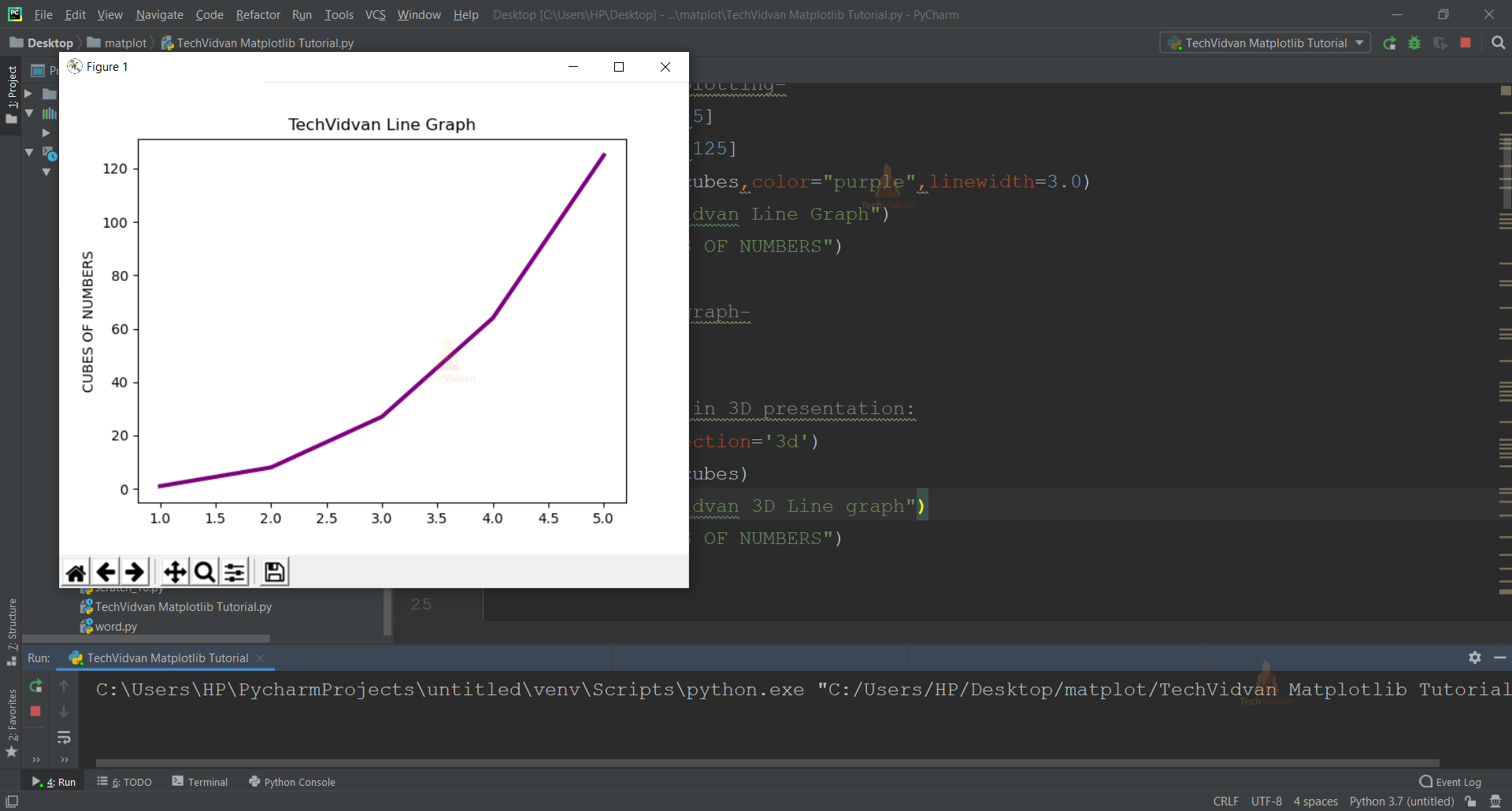
a. LINE GRAPHS- plt.plot()
CODE SNIPPET:
Creating line graphs:
#Using Data for plotting–
x_axis= [1,2,3,4,5]
cubes=[1,8,27,64,125]
plt.plot(x_axis,cubes,color="purple",linewidth=3.0)
plt.title("TechVidvan Line Graph")
plt.ylabel("CUBES OF NUMBERS")
#To Display the graph–
plt.show()
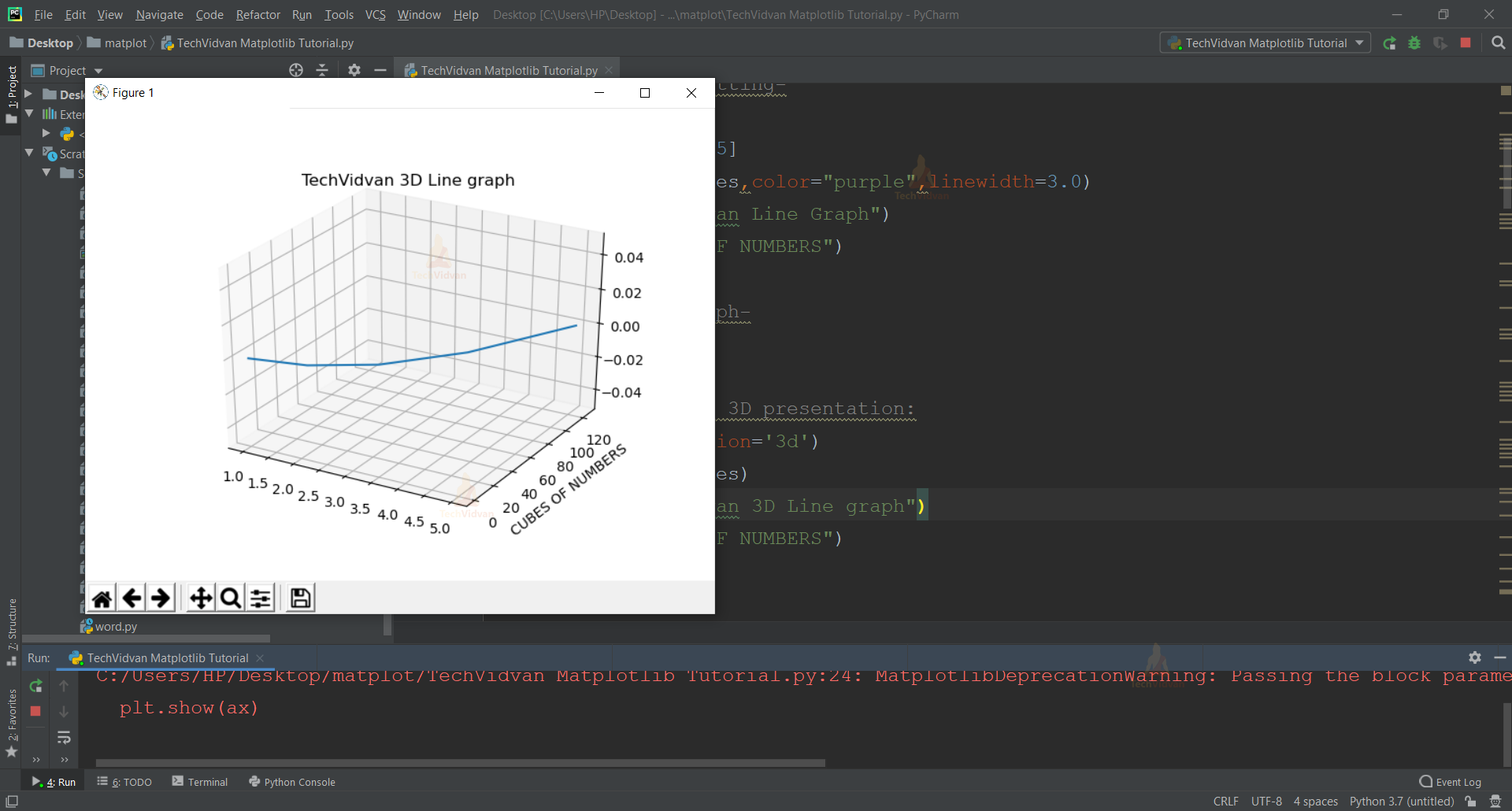
#Line Graphs in 3D presentation:
ax=plt.gca(projection=’3d’)
plt.plot(x_axis,cubes)
plt.title(“TechVidvan 3D Line Graph’’)
plt.ylabel(“CUBES OF NUMBERS”)
plt.show(ax)
- This is the default parameter style to plot graphs and these are simply line graphs.
- Note that in the function plt.plot(x, y), the first axis we enter would be shown on the x axis, which is x_axis for this particular code.
- Similarly, the second axis we enter would be shown on the y axis, which is cubes for this particular code.
- Color gives us the choice to represent the data line graph using different colors of choice.
- Linewidth determines the thickness of the data presenting line.
- We create a variable ax which takes the value plt.gca().
- GCA stands for Get Current axes. It takes the argument as projection=’3d’ which projects the axes in 3d form.
b. BAR GRAPHS- plt.bar()
- Under Bar Graphs plotting, it depends on the user whether they want to display it vertically(default) or horizontally.
CODE SNIPPET:
#Creating Bar graphs:
#Using Data for plotting–
age= [10,12,14,16,18]
height_in_ft=[5,5.2,5.4,5.6,5.8]
plt.bar(age,height_in_ft, color="red")
plt.title("TechVidvan Bar Graph")
plt.xlabel("Age")
plt.ylabel("Height")
plt.legend(["Average"])
#To display the graph–
plt.show()
#For a horizontal bar graph–
plt.barh(age,height_in_ft,color="yellow")
plt.title("TechVidvan Horizontal Bar Graph")
plt.xlabel("Height")
plt.ylabel("Age")
plt.xticks(age)
plt.yticks(height)
#To display the graph–
plt.show()
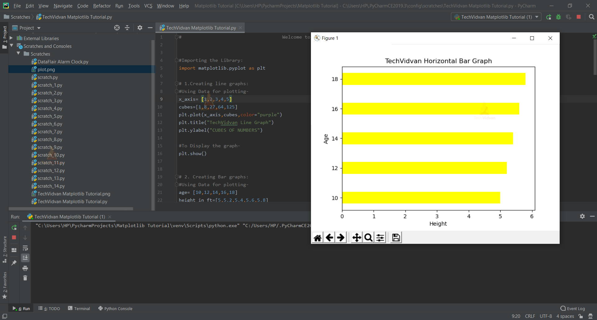
- Plt.bar() displays the graph on a vertical axis.
- Plt.barh() displays the graph on the horizontal axis. (Notice the h for horizontal).
- Plt.xticks()/yticks() displays the value of a particular bar according to its axes.
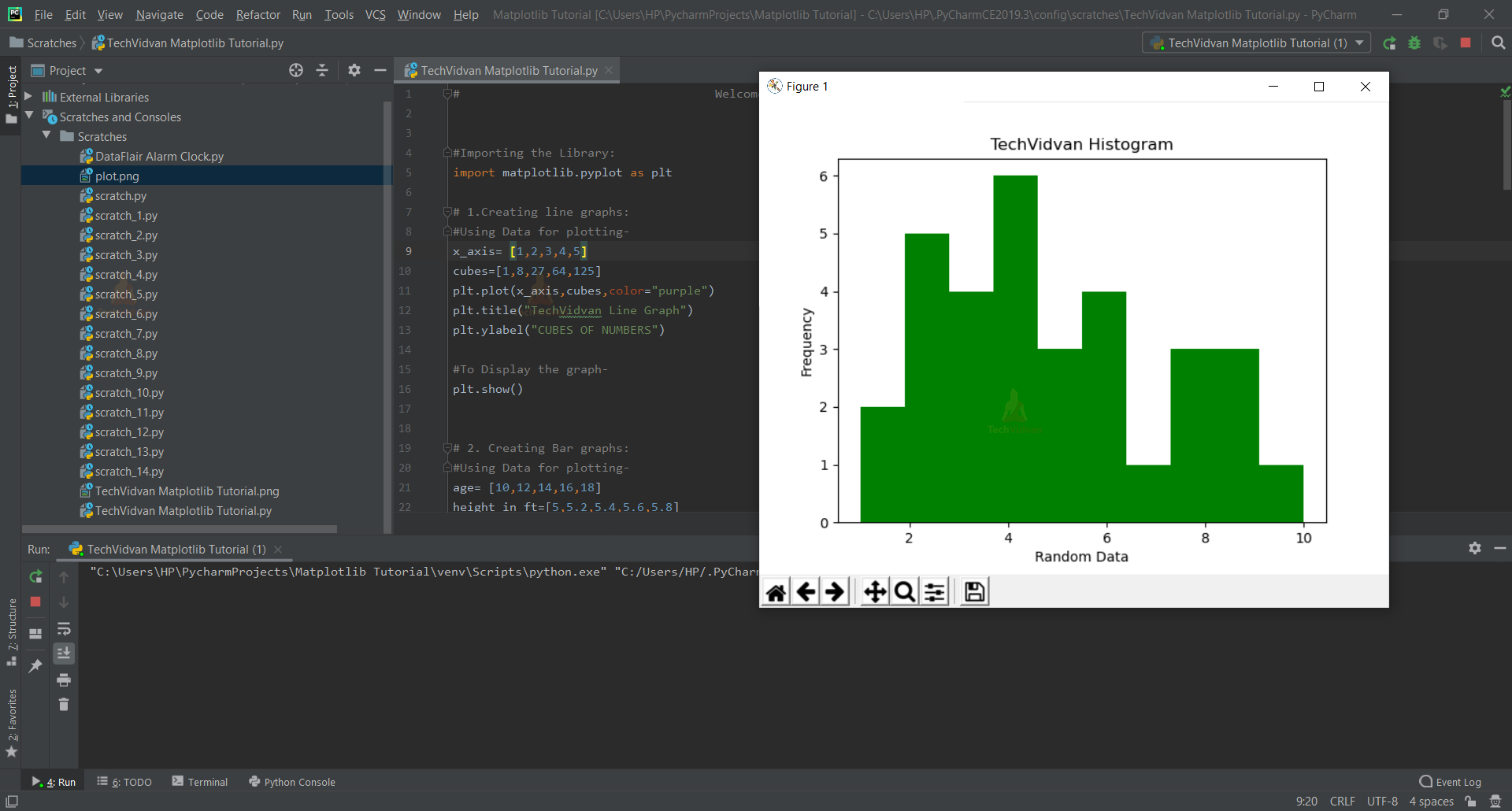
c. HISTOGRAMS – plt.hist()
An important argument to be used here is bins. The range for the whole data set used can be divided into equal parts known as class intervals. This way, we can combine the values to show their repetition or frequency.
CODE SNIPPET:
#To create a Histogram:
#Using some random data–
x= [2,2,2,5,4,3,6,4,2,8,6,4,3,8,9,1,9,6,5,4,3,10,1,3,2,6,4,8,7,5,4,9]
plt.hist(x,bins=10,color="green")
plt.title("TechVidvan Histogram")
plt.xlabel("Random Data")
plt.ylabel("Frequency")
#To display the graph–
plt.show()
d. SCATTER PLOTS – plt.scatter()
CODE SNIPPET:
#To create Scatter plots:
#Using Data for Plotting–
weekdays= ["Mon","Tue","Wed","Thu","Fri"]
working_hours=[7,8,9,8,7]
plt.scatter(weekdays,working_hours,s=10,color="grey")
plt.title("TechVidvan Scatter Plot")
plt.xlabel("Weekdays")
plt.ylabel("Working Hours of an employee")
#To display the graph–
plt.show()

S allows us to size how big the points we want to make on the graph.
e. PIE CHARTS – plt.pie()
CODE SNIPPET:
#To create pie charts:-
pencils=["HB","2B","3B","4B"]
price_in_rs=[2,3,5,7]
Explode=[0,0,0,0.1]
plt.pie(price_in_rs,explode=Explode,labels=pencils,startangle=45)
plt.title("TechVidvan Pie Chart")
#To display the graph–
plt.show()
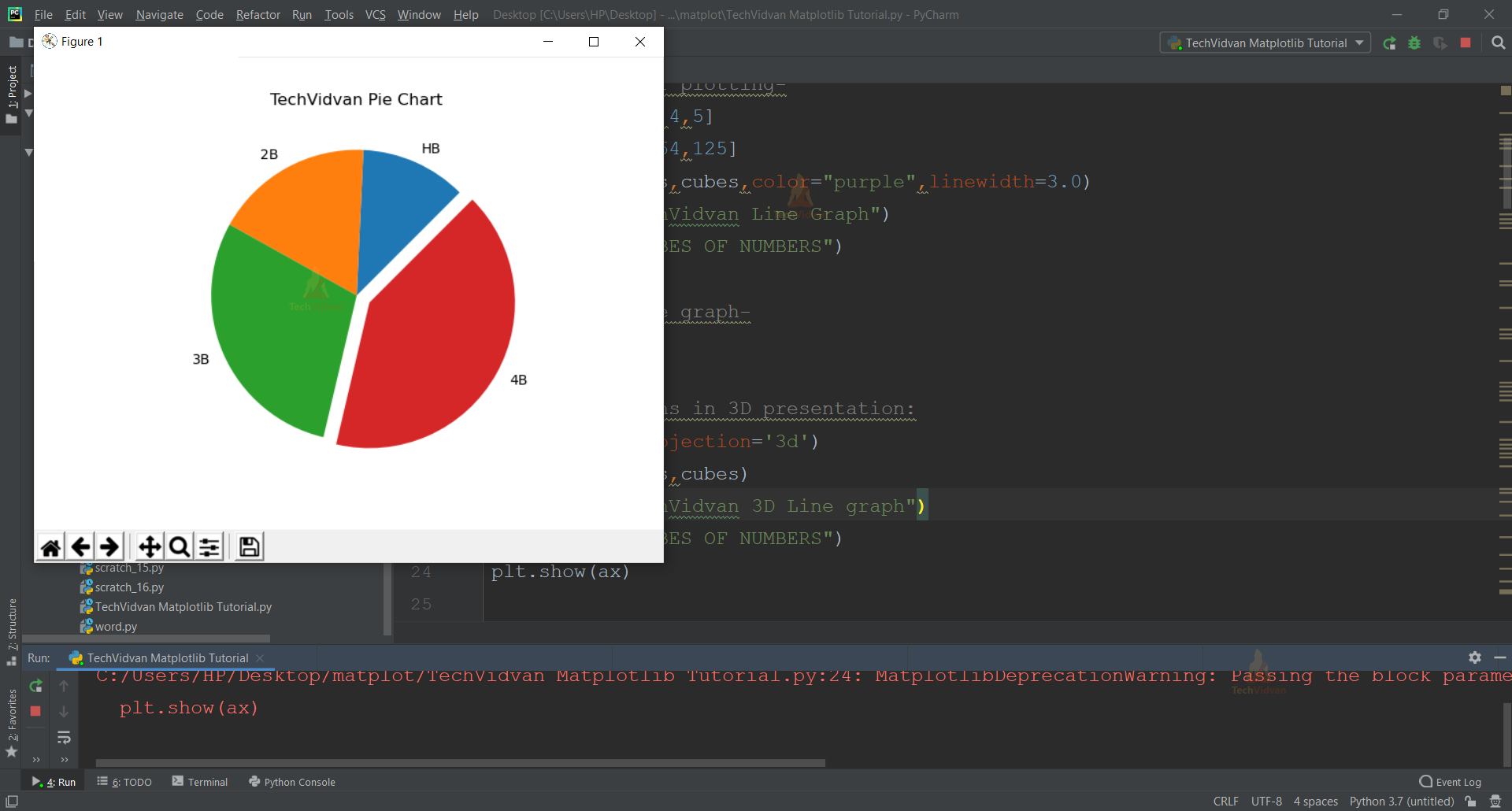
- Explode gives a starting point to all the fractions present for the pie chart.
- Startangle presents the chart on a certain angle we want to display that on.
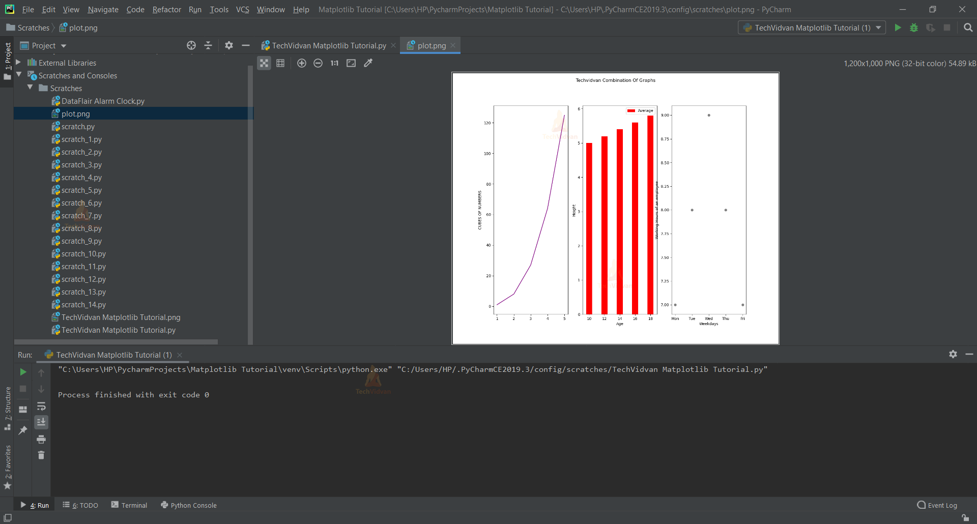
f. CATEGORIAL PLOTTING
To depict different kinds of graphs all at once, the subplot () function is pretty handy. It creates a subplot under the main plot like a small section of its own, and takes the argument to be situated according to the plot grid.
CODE SNIPPET:
#To display all the plottings together:
plt.figure(figsize=(12,10))
plt.subplot(131)
plt.plot(x_axis,cubes,color="purple")
plt.ylabel("CUBES OF NUMBERS")
plt.subplot(132)
plt.bar(age,height_in_ft,color="red")
plt.xlabel("Age")
plt.ylabel("Height")
plt.legend(["Average"])
plt.subplot(133)
plt.scatter(weekdays,working_hours,color="grey")
plt.xlabel("Weekdays")
plt.ylabel("Working Hours of an employee")
#Heading For the Combination of graphs:
plt.suptitle("Techvidvan Combination Of Graphs")
#To save the plots in png image format:
plt.savefig("plot.png")
#To display the graph–
plt.show()
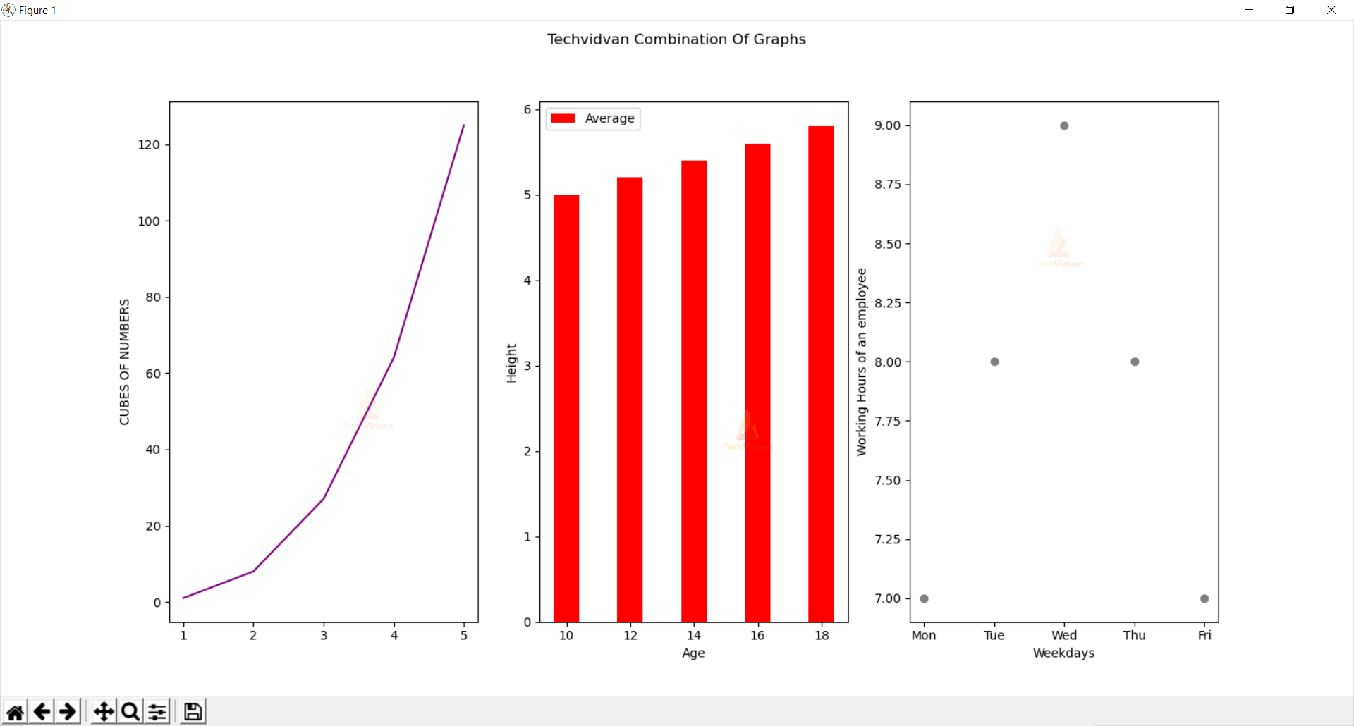
- Plt.figure()= Used to add objects of multiple axes altogether in a single figure.
- Plt.figure(figsize=()) = Used to specify the width and height of a figure in unit inches.
- Plt.subplot(p,q,r)= Divides the whole figure into an p*q grid and places the created axes in the position of r.
- Plt.suptitle()= Gives a centered heading to the figure.
g. TO SAVE THE PLOTS AS AN IMAGE FILE
#To save the plots in png image format:
plt.savefig("plot.png")
#To display the graph–
plt.show()
To save a plot in PNG form, savefig() function is used in which the argument we pass is the type of graph we want to get in the image format plus the extension of .png after it.
Make sure to write this function before the show () function for the flow of execution the program code follows.
Conclusion
Hooray!!
We’ve finally gone through the Matplotlib library and how to use its various features like line graphs, histograms, pie charts, scatter plots, and 3D graphs to make some aesthetically beautiful graphs of our own.