Breast Cancer Classification using Machine Learning
Breast cancer is one of the most common cancers among women and men globally. Breast cancer arises when cells in the breast start to develop abnormally. Due to this cancer, there is a huge number of deaths every year. It is the most common type of all cancers and also the main cause of women’s death worldwide.
Nowadays Classification and data mining methods are very effective ways to classify data. Especially when we talk about the medical field, wherewith the help of machine learning we use to diagnose the disease and analysis also to make particular decisions.
So with the help of Machine learning if we can classify the patient having which type of cancer, then it will be easy for doctors to provide timely treatment to patients and improve the chance of survival.
About Breast Cancer Classification Project:
In this Machine learning project we are going to analyze and classify Breast Cancer (that the breast cancer belongs to which category), as basically there are two categories of breast cancer that is:
- Malignant type breast cancer
- Benign type breast cancer
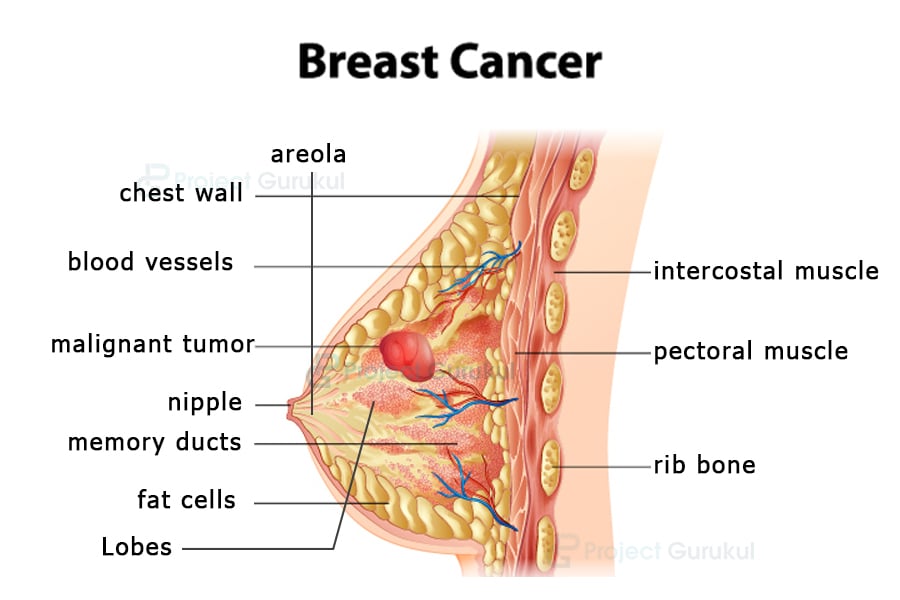
Image Source: ProjectGurukul
So our main aim in this project is that with the help of a dataset we will create a model which will correctly classify whether the Breast Cancer is of malignant or benign type.
Breast Cancer Dataset
We will be using a breast cancer dataset which you can download from this link: Breast Cancer Dataset
We are going to analyze the dataset completely, which will clear all your questions regarding what dataset we will be using, how many rows and columns are there, etc.
So there are 10 columns that are:
- Id
- Diagnosis
- Radius mean
- Texture mean
- Perimeter mean
- Area mean
- Smoothness mean
- Compactness mean
- Concavity mean
- Concave points
Project Prerequisites
I have worked on google collabs, if you work on your system please install the following libraries:
- Numpy
- Pandas
- Matplotlib
- Seaborn
- Sklearn
- Tensorflow
To install, open your command prompt and run:
pip install numpy
pip install tensorflow
pip install pandas
pip install sklearn
Download Breast Cancer Classification Project Code
Please download the source code of breast cancer classification using machine learning: Breast Cancer Classification Project Code
Now let’s start Analysing and Implementing our Breast Cancer Classification Project by TechVidvan:
1) Importing Libraries:
Firstly we have to import all the required libraries that we have installed above. We will also import some libraries at the time we will use them.
# Import libraries for Breast Cancer Classification Project
import numpy as np
import pandas as pd
import matplotlib.pyplot as plt
import seaborn as sns
2) Loading the dataset:
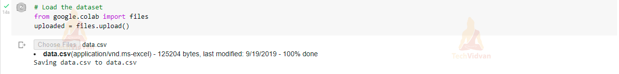
If you are using google collabs you have to first upload the dataset to access that data. So to upload the dataset run following command:
# Load the dataset
from google.colab import files
uploaded = files.upload()
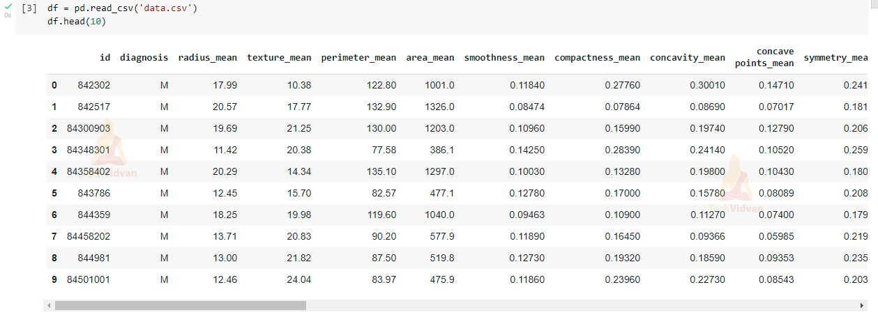
If you are using a jupyter notebook or working on your system, just read our dataset using read_csv() method.
df = pd.read_csv('data.csv')

#Now let’s view our dataset using head():

df.head(10)
3) Analysing the data:
Now we will analyse our dataset to see what is the shape of our data, how many empty values are present in our dataset, and we will drop those missing values using various methods provided by pandas.
# count the number of rows and columns in dataset:
df.shape
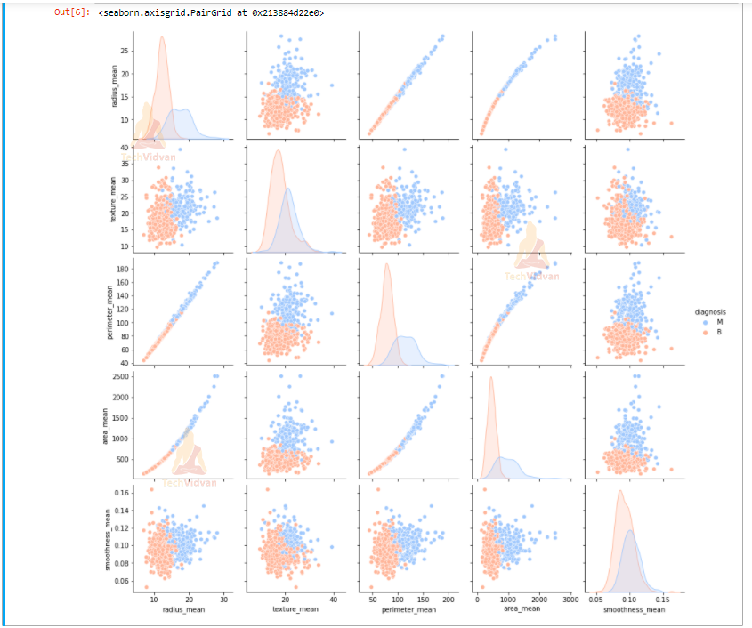
Let’s create a pairplot that will show us the complete relationship between radius mean, texture mean, perimeter mean, area mean and smoothness mean on the basis of diagnosis type.
sns.pairplot(df,hue = 'diagnosis', palette= 'coolwarm', vars = ['radius_mean', 'texture_mean', 'perimeter_mean','area_mean','smoothness_mean'])
# count the number of empty values in each columns:
df.isna().sum()

# drop the columns with all the missing values:
df = df.dropna(axis = 1)

df.shape

# Get the count of the number of Malignant(M) or Benign(B) cells
df['diagnosis'].value_counts()
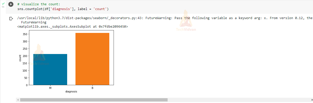
Now we will visualize the diagnosis column in our dataset to see how many malignant and benign are present.
# visualize the count:
sns.countplot(df['diagnosis'], label = 'count')
In this whole analyzing process we are going to convert our data and perform some data processing so that we can build a model which can classify the type of Breast cancer using this preprocessed data.
I have written comments above each line of code about what we are doing and why we are doing so that you can understand it better and easily.
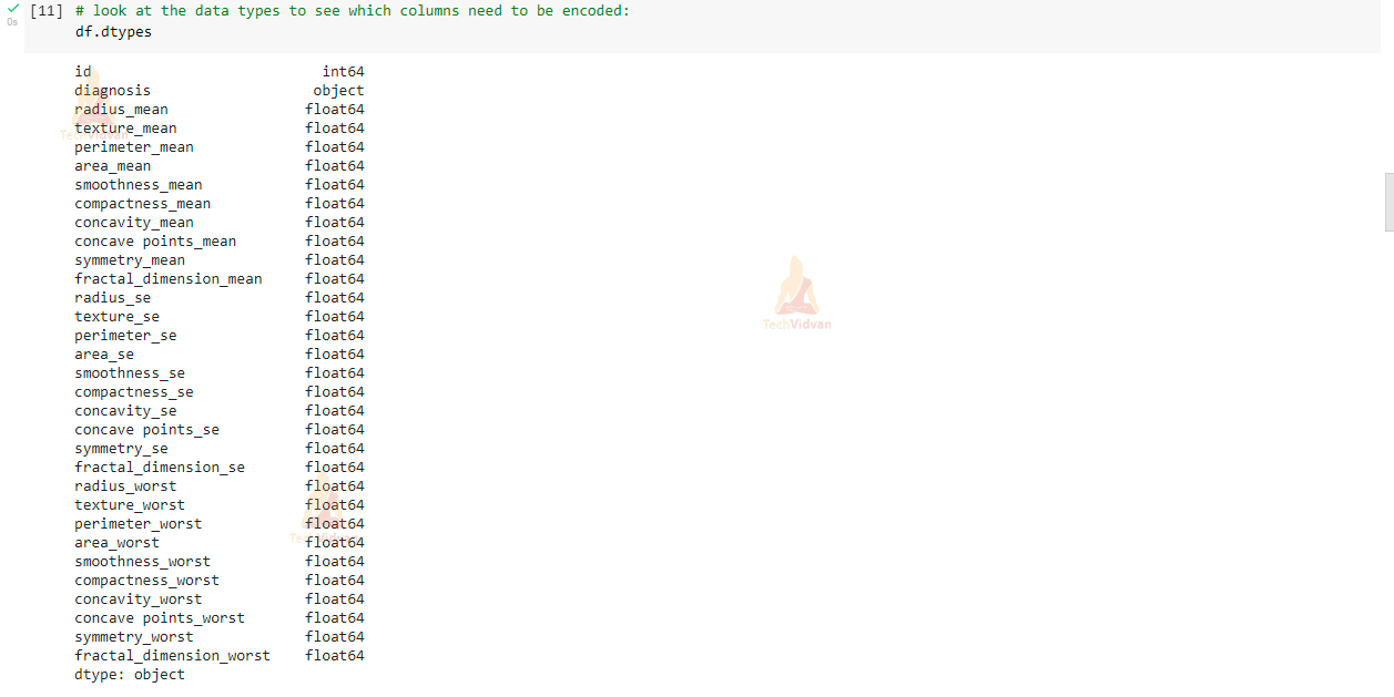
# look at the data types to see which columns need to be encoded:
df.dtypes
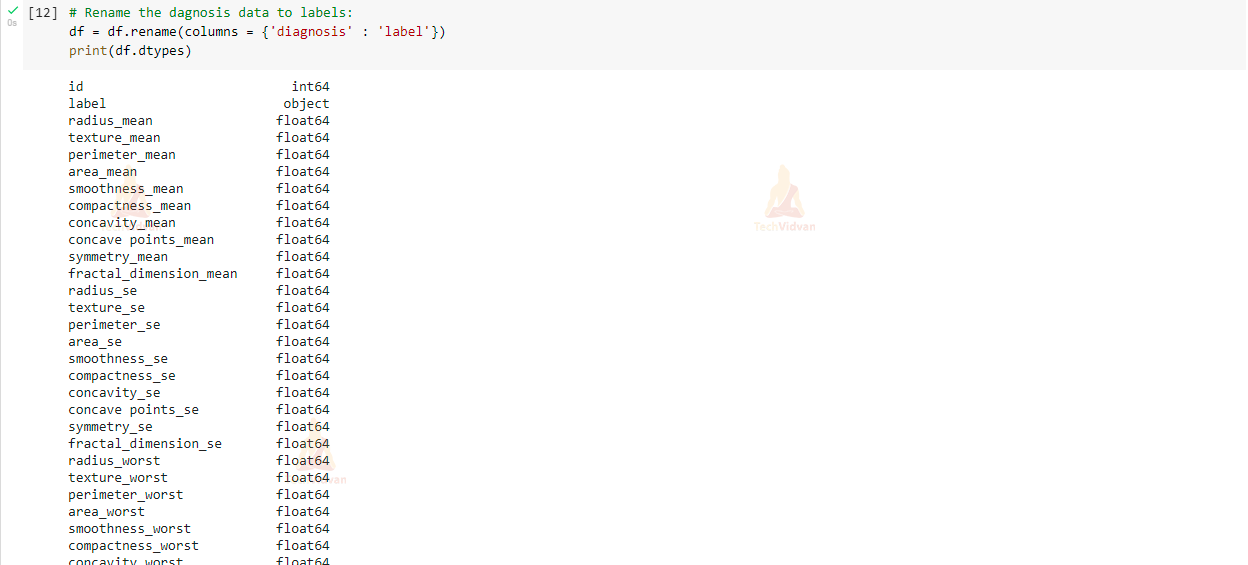
# Rename the diagnosis data to labels:
df = df.rename(columns = {'diagnosis' : 'label'})
print(df.dtypes)
# define the dependent variable that need to predict(label)
y = df['label'].values
print(np.unique(y))
4) Encoding Categorical Data:
Now we will convert our text (B and M) to integers (0 and 1) using LabelEncoder provided by sklearn library.
# Encoding categorical data from text(B and M) to integers (0 and 1)
from sklearn.preprocessing import LabelEncoder
labelencoder = LabelEncoder()
Y = labelencoder.fit_transform(y) # M = 1 and B = 0
print(np.unique(Y))
5) Defining X :
X will be our main features data which consists of all the columns except the label and id column. We also normalize our X data using MinMaxScaler provided by sklearn library.
# define x and normalize / scale value:

# define the independent variables, Drop label and ID, and normalize other data:
X  = df.drop(labels=['label','id'],axis = 1)

#scale / normalize the values to bring them into similar range:
from sklearn.preprocessing import MinMaxScaler
scaler = MinMaxScaler()
scaler.fit(X)
X = scaler.transform(X)

print(X)
6) Splitting Our data:
Now we will split our data into training data and testing data using train_test_split.
# Split data into training and testing data to verify accuracy after fitting the model
from sklearn.model_selection import train_test_split
x_train,x_test,y_train,y_test = train_test_split(X,Y, test_size = 0.25, random_state=42)
print('Shape of training data is: ', x_train.shape)
print('Shape of testing data is: ', x_test.shape)
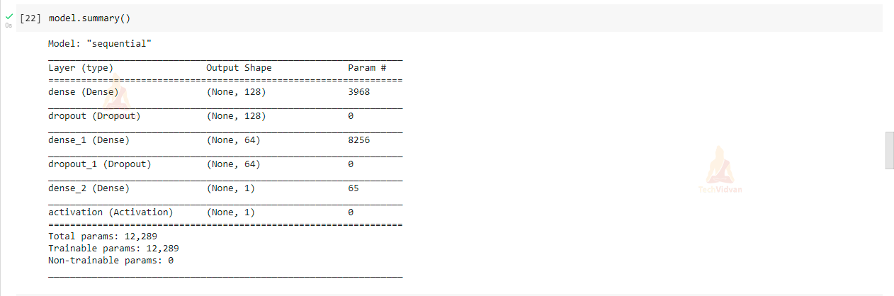
7) Creating Model:
In this step, we will be creating a Sequential model with the help of TensorFlow and Keras. In the model we have created three Dense layers in which one is the input layer with 128 hidden layers and the activation function is relu, and the second layer consists of 64 hidden layers with activation function relu and the third layer is final output layer and activation function is sigmoid.
import tensorflow
from tensorflow.keras.models import Sequential
from tensorflow.keras.layers import Dense, Activation, Dropout

model = Sequential()
model.add(Dense(128, input_dim=30, activation='relu'))
model.add(Dropout(0.5))
model.add(Dense(64,activation = 'relu'))
model.add(Dropout(0.5))
model.add(Dense(1))
model.add(Activation('sigmoid'))
8) Compile and fit ml model to our training data:
Compile the model and view a summary of the model
model.compile(loss = 'binary_crossentropy', optimizer = 'adam' , metrics = ['accuracy'])

model.summary()
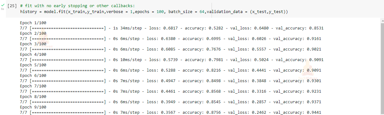
Fit the model to see the accuracy of training data:
# fit with no early stopping or other callbacks:
history = model.fit(x_train,y_train,verbose = 1,epochs = 100, batch_size = 64,validation_data = (x_test,y_test))
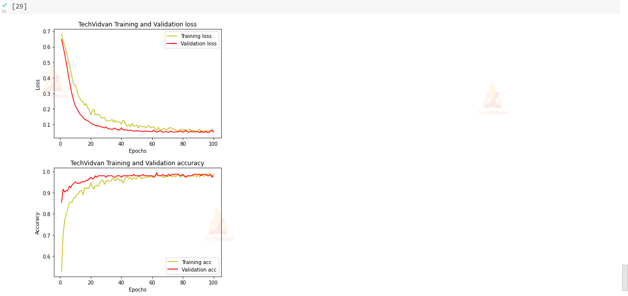
9) Visualizing our training accuracy and validation accuracy:
In this step, we will be analyzing our training accuracy and validation accuracy and also we will be plotting losses at each epoch with the help of matplotlib library.
# plot the training and validation accuracy and loss at each epochs:
loss = history.history['loss']
val_loss = history.history['val_loss']
epochs = range(1,len(loss)+1)
plt.plot(epochs,loss,'y',label = 'Training loss')
plt.plot(epochs,val_loss,'r',label = 'Validation loss')
plt.title('TechVidvan Training and Validation loss')
plt.xlabel('Epochs')
plt.ylabel('Loss')
plt.legend()
plt.show()

acc = history.history['accuracy']
val_acc = history.history['val_accuracy']
plt.plot(epochs,acc,'y',label = 'Training acc')
plt.plot(epochs,val_acc,'r',label = 'Validation acc')
plt.title('TechVidvan Training and Validation accuracy')
plt.xlabel('Epochs')
plt.ylabel('Accuracy')
plt.legend()
plt.show()
10) Prediction and Visualizing our model accuracy on test data:
This is the last step in which we will be seeing our model prediction of test data.
# Predicting the Test set results:
y_pred = model.predict(x_test)
y_pred = (y_pred > 0.5)

# Making the Confusion Matrix:
from sklearn.metrics import confusion_matrix
cm = confusion_matrix(y_test,y_pred)

sns.heatmap(cm, annot = True)
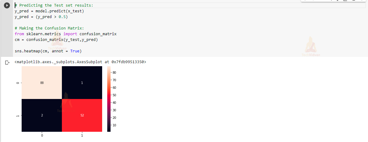
In this, we can see that our model is working very efficiently and accurately in classifying whether the breast cancer is of Malignant type or Benign type.
Summary
We have created a Breast Cancer Classification project in a very easy way using a Neural network. Our model accuracy is 98.8 % on training data and 97.9% accuracy on validation data. As we have also seen that our model is classifying test data very efficiently and accurately.
So in this project, we have learned how to analyze and visualize the data using pandas and matplotlib libraries. We have also learned the use of LabelEncoder, MinMaxScaler.