Crop Yield Prediction with Machine Learning using Python
With this Machine Learning Project, we will be doing crop yield prediction analysis. For this ml project, we are using the Gradient Regressor with 5-fold cross Validation.
So, let’s build this system.
Crop Yield Prediction
Predicting performance in unfamiliar and novel conditions is a major issues in crop production. The time and money required to create a sizable dataset, to reflect a broad range of genotypes and settings, are very complicated.
Soybean agriculture in North America has a long history; the first production was documented in Georgia in 1766. Since 1941, the United States Department of Agriculture (USDA) has organized North American yearly soybean yield trials, often known as Uniform Soybean Tests (UST), between public breeders. These tests are conducted to assess new and existing cultivars in a variety of settings that fall within their adaptable range.
The incorporation of genetic and environmental variables will thereby increase prediction accuracy. Also, these experiments are significant sources of historical and present data.
Gradient Boosting Algorithm
GBM is an ensemble model made up of M regression trees that were trained one after another sequentially in order to predict the mistakes of the preceding trees. GBM can be considered as gradient descent in a functional space, where a tree is built during each iteration of GBM to estimate the gradient of the objective function. If m = 1,…, M, then let Fm: Rp->R be a stage m predictive model. Create a differentiable loss function called L(Yi, Fm(xi)). The squared error loss, for the typical regression scenario, is, for instance, LSE(Yi, Fm(xi)) = (Yi Fm(xi))2.
By estimating a parameter that minimizes the total loss (given the squared error F0(xi) = y ), GBM starts with a constant model. Then, a regression decision tree is trained to reduce the empirical risk at every iteration m
h = argmin h Σ N i=1L(Yi , Fm−1(xi) + h(xi)).
The gradients of each sample with respect to the current estimate at stage m, are used to fit a regression tree to determine h. By using a line search, the ideal step size is determined for each leaf. The model is updated using Fm = Fm1 + h, and a learning rate is used to lessen over-fitting. Until M trees have developed, this process is repeated. Later, Friedman demonstrated that a stochastic tweak to GBM can significantly reduce the prediction error of GBM. This was motivated by Breiman’s bootstrap-aggregating (bagging). The stochastic version of GBM fits each tree on a portion of the training set that was randomly selected without replacement.
GBM Implementation
Machine Learning contains numerous examples of GBM implementations. Friedman’s GBM, which is built on CART trees, is followed by many of these implementations. Modern ML projects necessitate very huge datasets in the era of big data. As a result, more scalable, distributed GBM systems are required. The most notable use, in this case, is XGBoost.
XGBoost offers two primary benefits:
- It integrates innovative improvements like out-of-core computation and sparsity awareness with earlier theories of distributed computing. Consequently, both on a single system and in a distributed context, the run-time is much reduced.
- Changes made by XGBoost is the addition of a new regularised learning objective that penalizes model complexity. The end product is massively scaled which generates cutting-edge results and takes first place in numerous open data science competitions.
Project Prerequisites
The requirement for this project is Python 3.6 installed on your computer. I have used a Jupyter notebook for this project. You can use other IDE if you want. The required modules for this project are –
- Numpy(1.22.4) – pip install numpy
- Pandas(1.5.0) – pip install pandas
- Seaborn(0.9.0) – pip install seaborn
- Scipy(1.9.2) – pip install scipy
- SkLearn(1.1.1) – pip install sklearn
That’s all we need for our project.
Crop Yield Prediction Project & DataSet
We have provided the source code as well as dataset that will be required in crop yield prediction project. We will require a csv file for this project. You can download the dataset and the jupyter notebook from the link below.
Download the dataset and the jupyter notebook from the following link: Crop Yield Prediction Project
Steps to Implement
- Import the modules and the libraries. For this project, we are importing the libraries numpy, pandas, and sklearn and metrics. Here we also read our dataset and we are saving it into a variable.
import pandas as pd #importing the pandas module which we will be using in this project.
import numpy as np #importing the numpy module which we will be using in this project.
import matplotlib.pyplot as plt #importing the matplotlib.pyplot module which we will be using in crop yield prediction project.
import seaborn as sns #importing the seaborn module which we will be using in this project.
import warnings #importing the warnings module which we will be using in this project.
from sklearn.metrics import mean_squared_error #importing the mean_squared-error sklearn.metrics module which we will be using in this project.
from scipy.stats import pearsonr #importing the scipy.stats and pearsonr module which we will be using in this ml project.
from sklearn.model_selection import cross_val_score, cross_val_predict #importing the cross_val_score module which we will be using in this machine learning project.
from sklearn import metrics #importing the metrics from sklearn module which we will be using in this project.

import pandas as pd #importing the pandas module which we will be using in this project.
import numpy as np #importing the numpy module which we will be using in this machine learning project.
import matplotlib.pyplot as plt #importing the matplotlib.pyplot module which we will be using in this project.
import seaborn as sns #importing the seaborn module which we will be using in this project.
import warnings #importing the warnings module which we will be using in this project.
from sklearn.metrics import mean_squared_error #importing the mean_squared-error sklearn.metrics module which we will be using in this project.
from scipy.stats import pearsonr #importing the scipy.stats and pearsonr module which we will be using in this project.
from sklearn.model_selection import cross_val_score, cross_val_predict #importing the cross_val_score module which we will be using in this project.
from sklearn import metrics #importing the metrics from sklearn module which we will be using in crop yield prediction project.
2. Here we are reading our dataset. And we are printing our dataset
df_cotton=pd.read_csv('Unprocessed Data.csv') #reading the dataset Unprocessed Data csv file
df_cotton #printing our dataset file
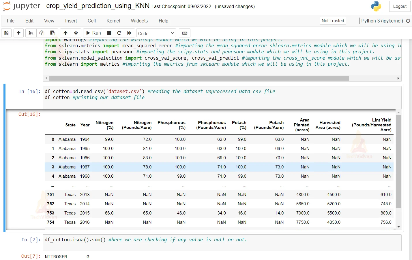
3. Here we are checking if any value is null or not
df_cotton.isna().sum() #here we are checking if any value is null or not.
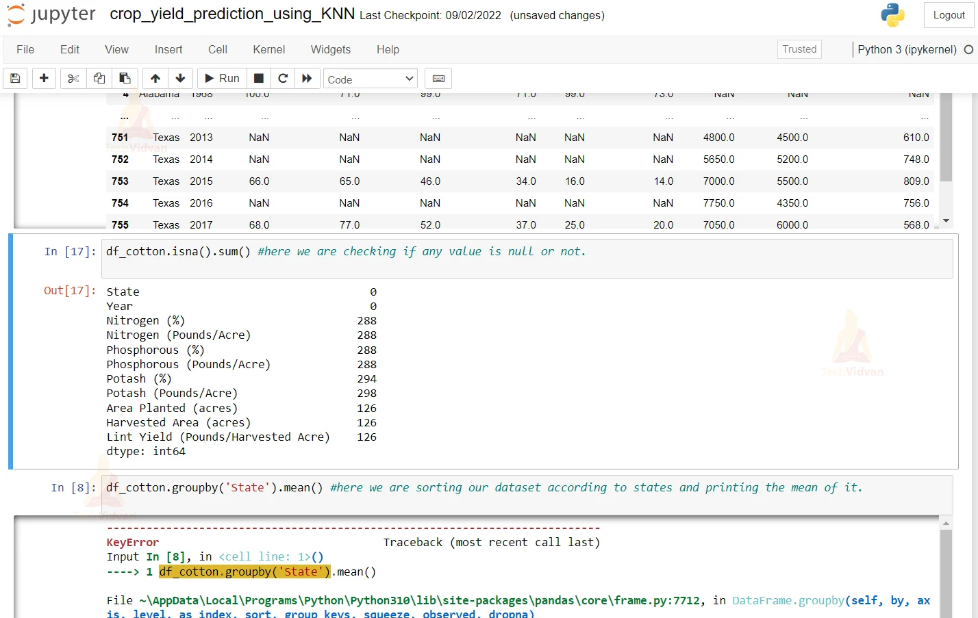
4. Here we are sorting the dataset according to the State and printing the mean of it.
df_cotton.groupby('State').mean() #here we are sorting our dataset according to states and printing the mean of it
5. Here we are filling the null values with mean of the State column.
df_cotton=df_cotton.fillna(df_cotton.groupby('State').transform('mean')) #here we are filling the null or empty values by mean of the column
6. Here we are printing the dataset again.
df_cotton #here we are printing the dataset again to see the chnages
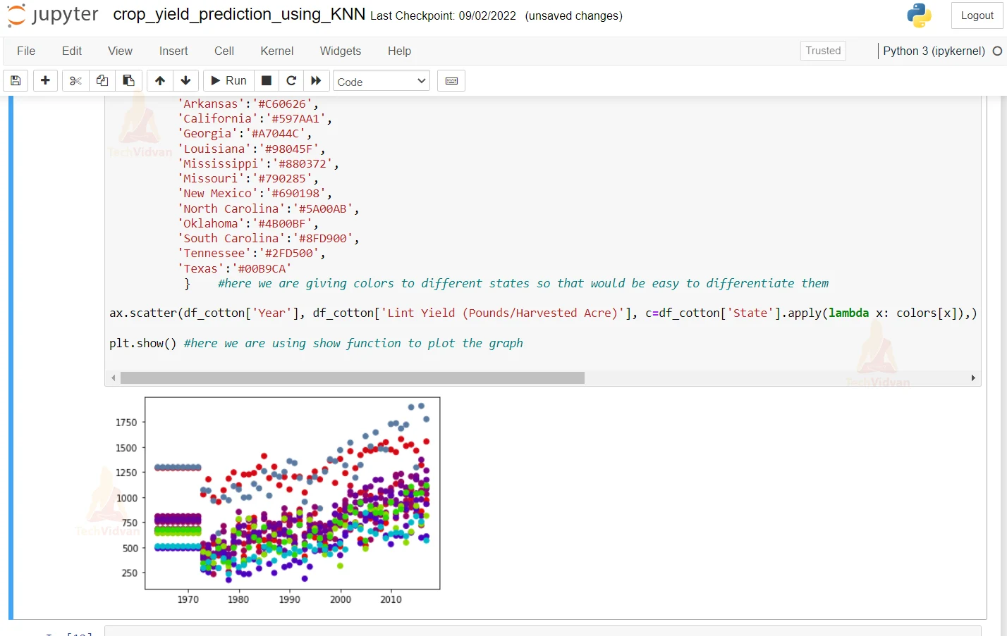
7. Here we are plotting the Year and States graph.
fig, ax = plt.subplots() #here we are plotting the subplots and plotting it

colors = {'Alabama':'#E50800',
          'Arizona':'#D50713',
          'Arkansas':'#C60626',
          'California':'#597AA1',
          'Georgia':'#A7044C',
          'Louisiana':'#98045F',
          'Mississippi':'#880372',
          'Missouri':'#790285',
          'New Mexico':'#690198',
          'North Carolina':'#5A00AB',
          'Oklahoma':'#4B00BF',
          'South Carolina':'#8FD900',
          'Tennessee':'#2FD500',
          'Texas':'#00B9CA'
           }    #here we are giving colors to different states so that would be easy to differentiate them

ax.scatter(df_cotton['Year'], df_cotton['Lint Yield (Pounds/Harvested Acre)'], c=df_cotton['State'].apply(lambda x: colors[x]),) #here we are suing a lambda function on our states and giving it a color that we defined in rpevious line

plt.show() #here we are using show function to plot the graph
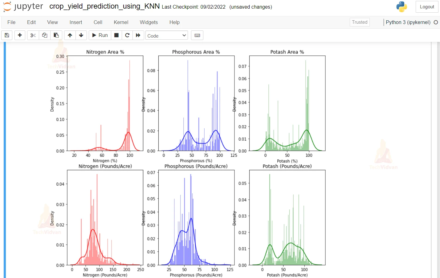
8. Here we are plotting the curves of the different nutrients like Nitrogen, Phosphorous, and Potash.
plt.figure(figsize=(12,10))
plt.subplot(231) #here we are using the subplot function to plot the graph
sns.distplot(df_cotton['Nitrogen (%)'], color='r', bins=100, hist_kws={'alpha': 0.4}) #here we are printing the graph of Nitrogen gas and we are giving it a red color
plt.title('Nitrogen Area %') #here we are giving the title red to the Nitrogen Area graph

plt.subplot(232) #here we are using the subplot function to plot the graph
sns.distplot(df_cotton['Phosphorous (%)'], color='b', bins=100, hist_kws={'alpha': 0.4})  #here we are printing the graph of Phosphoros gas and we are giving it a blue color
plt.title('Phosphorous Area %')#here we are giving the title red to the Phosphorous Area graph

plt.subplot(233) #here we are using the subplot function to plot the graph
sns.distplot(df_cotton['Potash (%)'], color='g', bins=100, hist_kws={'alpha': 0.4})  #here we are printing the graph of Potash gas and we are giving it a green color
plt.title('Potash Area %')#here we are giving the title red to the Potash Area graph

plt.subplot(234) #here we are using the subplot function to plot the graph
sns.distplot(df_cotton['Nitrogen (Pounds/Acre)'], color='r', bins=100, hist_kws={'alpha': 0.4})  #here we are printing the graph of Nitrogen gas and we are giving it a red color
plt.title('Nitrogen (Pounds/Acre)')#here we are giving the title red to the Nitrogen Area graph

plt.subplot(235) #here we are using the subplot function to plot the graph
sns.distplot(df_cotton['Phosphorous (Pounds/Acre)'], color='b', bins=100, hist_kws={'alpha': 0.4})  #here we are printing the graph of Phosphorous gas and we are giving it a blue color
plt.title('Phosphorous (Pounds/Acre)')#here we are giving the title red to the Phosphorous Area graph

plt.subplot(236) #here we are using the subplot function to plot the graph
sns.distplot(df_cotton['Potash (Pounds/Acre)'], color='g', bins=100, hist_kws={'alpha': 0.4}) #here we are printing the graph of Potash gas and we are giving it a green color
plt.title('Potash (Pounds/Acre)')#here we are giving the title red to the Potash Area graph
9. Here we are describing a bar graph and we are making x label as Lint Yield and y label as State as State Name.
plt.figure(figsize=(22,6)) #here we are trying to plot bar graph between states and Lint Yield columns
GraphData=df_cotton.groupby(['State'])['Lint Yield (Pounds/Harvested Acre)'].sum().nlargest(10) #we are sorting according to states and


GraphData.plot(kind='bar') #here we are describing that we want a bar graph
plt.ylabel('Lint Yield') #we are giving X label as Lint Yield
plt.xlabel('State Name') #we are giving Y label as State Name
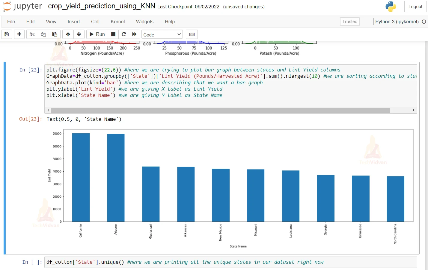
10. Here we are printing all the unique states in our datasets right now.
df_cotton['State'].unique() #here we are printing all the unique states in our dataset right now
11. Here we are describing a mapping for all states that are present in our dataset i.e. we are giving a number to each and every state which that would be useful in our model.
mapping = ({'Alabama':1,
'Arizona':2,
'Arkansas':3,
'California':4,
'Georgia':5,
'Louisiana':6,
'Mississippi':7,
'Missouri':8,
'New Mexico':9,
'North Carolina':10,
'Oklahoma':11,
'South Carolina':12,
'Tennessee':13,
'Texas':14,
           })# here we describing a mapping for all the states that is present in our dataset
df_cotton=df_cotton.replace({'State': mapping}) #here we are replacing our States mapping with our defined mapping in our previous line
12. Here we are printing the dataset to see whether the changes were made.
df_cotton #here we are prining our dataset again.
13. Here we are creating our X and Y dataset.
x=df_cotton.drop('Lint Yield (Pounds/Harvested Acre)',axis=1) #we are removing the column of Lint Yield becuase that is our output dataset and we are storing it in our output datset.
y=df_cotton['Lint Yield (Pounds/Harvested Acre)'] #storing our output dataset in a new variable called y

x #here we are printing x and checking our output
#image#
y #here we are printing our y dataset.
14. Here we are using the Pearson method on state and year and all other columns and printing the correlations of all of them.
cor1, _ = pearsonr(df_cotton['State'], df_cotton['Lint Yield (Pounds/Harvested Acre)']) #using the pearsonr method on the State and the Lint Yield column in our datset and we are doing it to find the correlation
print('%.3f' % cor1) #printing the state and Lint Yield pearsonr correlation vlaue using the print funciton

cor1, _ = pearsonr(df_cotton['Year'], df_cotton['Lint Yield (Pounds/Harvested Acre)']) #using the pearsonr method on the State and the Lint Yield column in our datset and we are doing it to find the correlation
print('%.3f' % cor1)#printing the state and Lint Yield pearsonr correlation vlaue using the print funciton

cor1, _ = pearsonr(df_cotton['Nitrogen (%)'], df_cotton['Lint Yield (Pounds/Harvested Acre)']) #using the pearsonr method on the State and the Lint Yield column in our datset and we are doing it to find the correlation
print('%.3f' % cor1)#printing the state and Lint Yield pearsonr correlation vlaue using the print funciton

cor1, _ = pearsonr(df_cotton['Nitrogen (Pounds/Acre)'], df_cotton['Lint Yield (Pounds/Harvested Acre)']) #using the pearsonr method on the State and the Lint Yield column in our datset and we are doing it to find the correlation
print('%.3f' % cor1)#printing the state and Lint Yield pearsonr correlation vlaue using the print funciton

cor1, _ = pearsonr(df_cotton['Phosphorous (%)'], df_cotton['Lint Yield (Pounds/Harvested Acre)']) #using the pearsonr method on the State and the Lint Yield column in our datset and we are doing it to find the correlation
print(' %.3f' % cor1)#printing the state and Lint Yield pearsonr correlation vlaue using the print funciton

cor1, _ = pearsonr(df_cotton['Phosphorous (Pounds/Acre)'], df_cotton['Lint Yield (Pounds/Harvested Acre)']) #using the pearsonr method on the State and the Lint Yield column in our datset and we are doing it to find the correlation
print('%.3f' % cor1)#printing the state and Lint Yield pearsonr correlation vlaue using the print funciton

cor1, _ = pearsonr(df_cotton['Potash (%)'], df_cotton['Lint Yield (Pounds/Harvested Acre)']) #using the pearsonr method on the State and the Lint Yield column in our datset and we are doing it to find the correlation
print('%.3f' % cor1)#printing the state and Lint Yield pearsonr correlation vlaue using the print funciton

cor1, _ = pearsonr(df_cotton['Potash (Pounds/Acre)'], df_cotton['Lint Yield (Pounds/Harvested Acre)']) #using the pearsonr method on the State and the Lint Yield column in our datset and we are doing it to find the correlation
print(' %.3f' % cor1)#printing the state and Lint Yield pearsonr correlation vlaue using the print funciton

cor1, _ = pearsonr(df_cotton['Area Planted (acres)'], df_cotton['Lint Yield (Pounds/Harvested Acre)']) #using the pearsonr method on the State and the Lint Yield column in our datset and we are doing it to find the correlation#using the pearsonr method on the State and the Lint Yield column in our datset and we are doing it to find the correlation
print(' %.3f' % cor1)#printing the state and Lint Yield pearsonr correlation vlaue using the print funciton

cor1, _ = pearsonr(df_cotton['Harvested Area (acres)'], df_cotton['Lint Yield (Pounds/Harvested Acre)']) #using the pearsonr method on the State and the Lint Yield column in our datset and we are doing it to find the correlation
print('%.3f' % cor1)#printing the state and Lint Yield pearsonr correlation vlaue using the print funciton
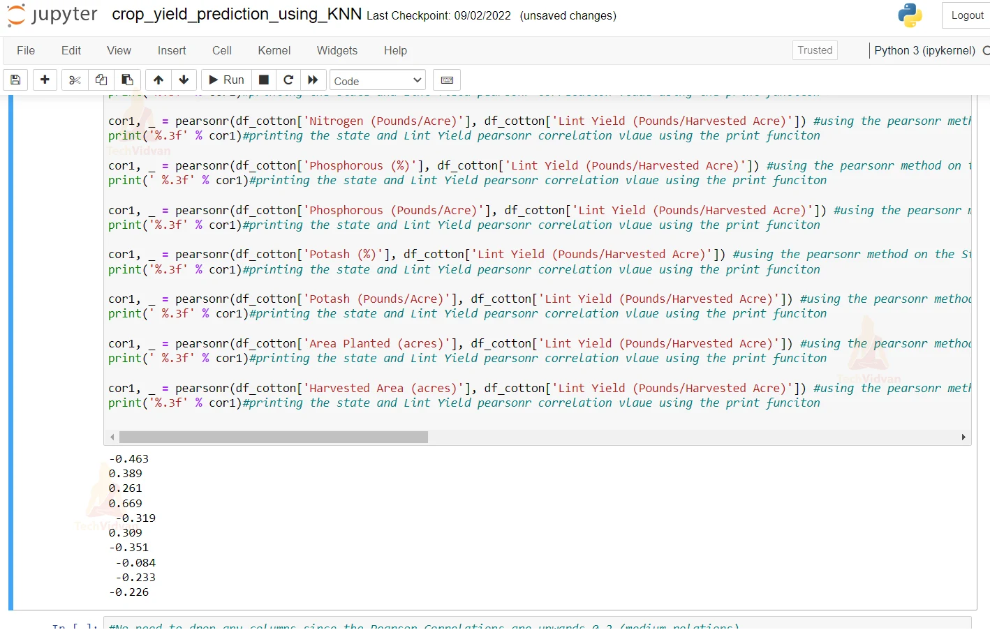
15. As we can see that the pearson correlations are upward so there is no need to drop any columns. Also here we are dividing our dataset into testing and training & we are keeping a ratio of 80:20 for training and testing respectively.
#No need to drop any columns since the Pearson Correlations are upwards 0.2 (medium relations)
from sklearn.model_selection import train_test_split #importing the train_test_split model
x_train,x_test,y_train,y_test=train_test_split(x,y,test_size=0.2) #80% for Training and 20% for Testing
print(x_train.shape,x_test.shape,y_train.shape,y_test.shape) #printing the shapes of the X_train and Y_train and also we are printing the Y_test shapes

from sklearn import ensemble #importing the ensemble module from sklearn
yield_predict = ensemble.GradientBoostingRegressor(n_estimators = 100, max_depth = 5, min_samples_split = 2,
          learning_rate = 0.1, loss = 'ls') #importing the Gradient Boosting Regressor from the ensemble and passing the the values like leraning rate and loss and max depth =5 and min_sample_split = 2

yield_predict.fit(x_train, y_train) #passing the x and y training dataset and fitting it into the model.

yield_predict_test=yield_predict.predict(x_test) #using the model and passing the XTest value to get the testing dataset
yield_predict_train=yield_predict.predict(x_train)#using the model and passing the XTest value to get the testing dataset
pd.DataFrame({'actual unseen data':y_train,'predicted unseen data':yield_predict_train}) #making the dataframe from the actual and the predicted data of y_train and yield_predicted
16. Here we are using the cross validation function to print the cross validation score of the predicted value against teh testing value. Other than this, we are printing the R2 scores as well.
scores = cross_val_score(yield_predict, x_test, y_test, cv=5)#printing the cross validation score of the predicted value against the testing value
scores#printing the  score calcualted in the previous step

predictions = cross_val_predict(yield_predict, x_test, y_test, cv=5) #printing the cross validation score of the predicted value against the testing value
accuracy = metrics.r2_score(y_test, predictions) #checking the accuracy score by taking the R2 score of the actual and the predicted value
accuracy#printing the accuracy score calcualted in the previous step
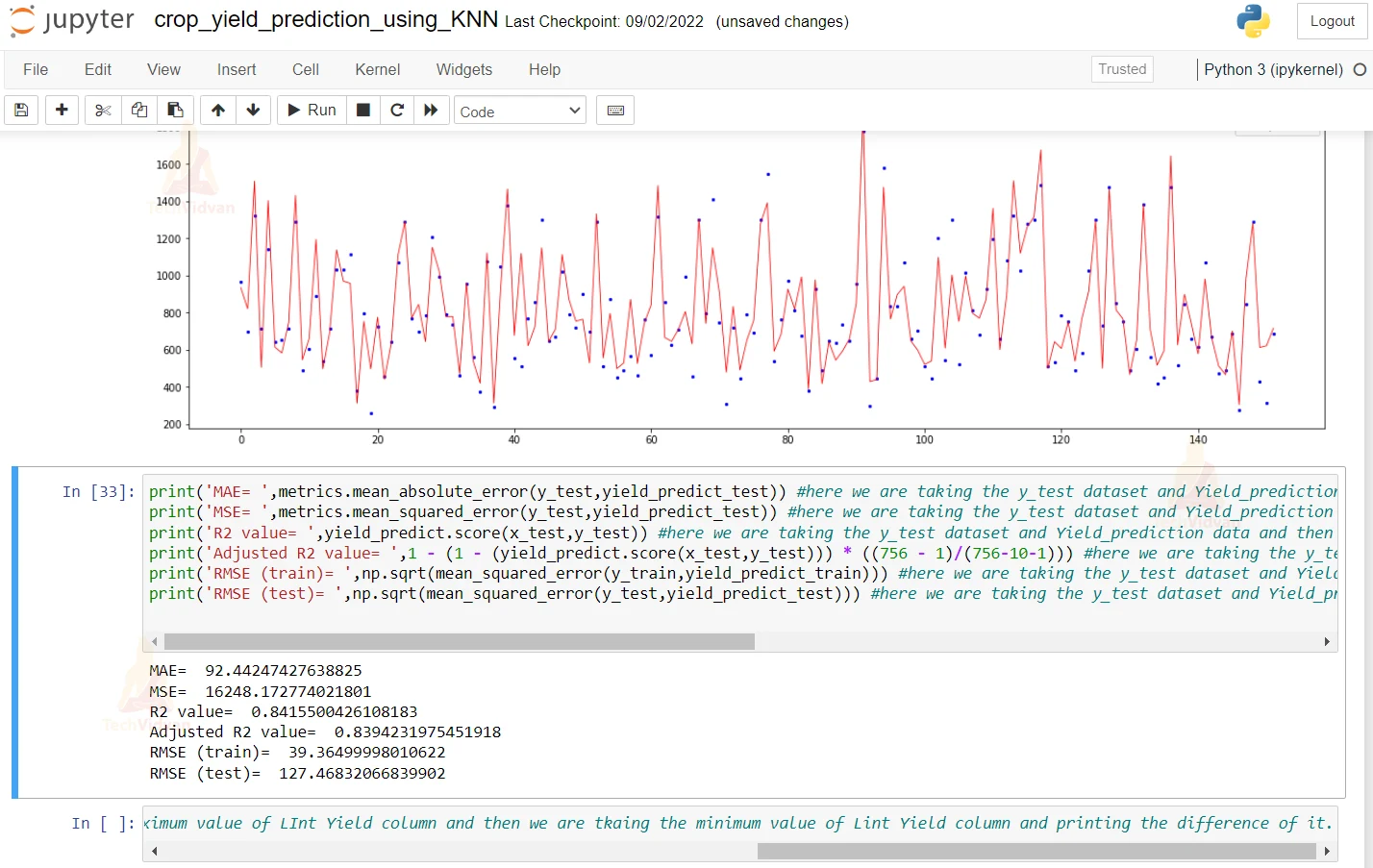
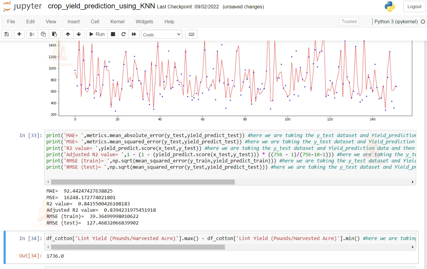
17. Here we are plotting the graph of the predicted and the actual value. For that, we are passing the x and y value to the plot function to actually plot the graph.
x_ax = range(len(y_test)) #here we are taking the length of the y_test dataset
plt.figure(figsize=(20,6)) #defining the size of the plot figure which is 26 6

plt.scatter(x_ax, y_test, s=5, color="blue", label="original") #defining the attributes of the plot scatter that color should be blue
plt.plot(x_ax, yield_predict_test, lw=0.8, color="red", label="predicted") #passing the x and the y values to the plot function to actually plot the graph and giving it red color to it.
plt.legend() #plotting the legend
plt.show() #plotting the show and using the show function
18. Here we are printing the Mean Absolute error and mean squared error. Other than this, we are printing the Root Mean Squared error and R2 score.
print('MAE= ',metrics.mean_absolute_error(y_test,yield_predict_test)) #here we are taking the y_test dataset and Yield_prediction data and then we are printing the mean absolute error of the predicted and the actual value.
print('MSE= ',metrics.mean_squared_error(y_test,yield_predict_test)) #here we are taking the y_test dataset and Yield_prediction data and then we are printing the mean squared error of the predicted and the actual value.
print('R2 value= ',yield_predict.score(x_test,y_test)) #here we are taking the y_test dataset and Yield_prediction data and then we are printing the R2 error of the predicted and the actual value.
print('Adjusted R2 value= ',1 - (1 - (yield_predict.score(x_test,y_test))) * ((756 - 1)/(756-10-1))) #here we are taking the y_test dataset and Yield_prediction data and then we are printing the adjusted R2 error of the predicted and the actual value.
print('RMSE (train)= ',np.sqrt(mean_squared_error(y_train,yield_predict_train))) #here we are taking the y_test dataset and Yield_prediction data and then we are printing the root mean squared error of the predicted and the actual value.
print('RMSE (test)= ',np.sqrt(mean_squared_error(y_test,yield_predict_test))) #here we are taking the y_test dataset and Yield_prediction data and then we are printing the root mean squared error of the predicted and the actual value.
df_cotton['Lint Yield (Pounds/Harvested Acre)'].max() - df_cotton['Lint Yield (Pounds/Harvested Acre)'].min() #here we are taking the maximum value of LInt Yield column and then we are tkaing the minimum value of Lint Yield column and printing the difference of it.
Summary
In this Machine Learning project, we are doing a crop yield prediction using the Gradient Boosting algorithm. We hope you have learned something new in this project.