Android GridLayout with Example and Implementation
Android GridLayout is used to display elements and views in the form of a rectangular grid. GirdLayout and GridView are two completely different terms and are used for other purposes. GridView is a view, whereas GridLayout is a layout that can hold various views in it. Using GridView, you can display the items that are coming from the Adapter.
GridLayout allows you to place many views and elements inside the layout and then style them. It allows you to set the number of rows and columns for your grid. So through this article, we will try to understand how you can use GridLayout while designing your layouts.
About GridLayout
Android provides you with a feature to style your app screens using various types of layouts. Some of the most commonly used layouts are LinearLayout, Constraint Layout, RelativeLayout, and GridLayout.
Suppose you need to display the elements linearly, whether horizontally or vertically; you can use LinearLayout. Similarly, if you wish to display elements and views in rows and columns, you use the GridLayout.
Let’s see how you can create a GridLayout in Android.
XML Code:
<GridLayout xmlns:android="http://schemas.android.com/apk/res/android"
    xmlns:tools="http://schemas.android.com/tools"
    android:layout_width="match_parent"
    android:layout_height="match_parent"
    android:rowCount="4"
    android:columnCount="2"
    android:background="#3F51B5"
    tools:context=".MainActivity">

</GridLayout>
Now let’s see how you can add several child elements in your GridLayout. The child elements can be any view element, such as Buttons, ImageViews, TextViews, etc. Below is an example that shows you how you can add child elements in a GridLayout.
Code:
<?xml version="1.0" encoding="utf-8"?>
<GridLayout xmlns:android="http://schemas.android.com/apk/res/android"
    xmlns:tools="http://schemas.android.com/tools"
    android:layout_width="match_parent"
    android:layout_height="match_parent"
    android:rowCount="4"
    android:columnCount="2"
    android:background="#3F51B5"
    tools:context=".MainActivity">

    <ImageView
        android:layout_height="90dp"
        android:layout_width="130dp"
        android:layout_margin="10dp"
        android:src="@drawable/image_1"
        />

    <ImageView
        android:layout_height="90dp"
        android:layout_width="200dp"
        android:layout_margin="10dp"
        android:src="@drawable/image_2"
        />

    <ImageView
        android:layout_height="90dp"
        android:layout_width="130dp"
        android:layout_margin="10dp"
        android:src="@drawable/image_3"
        />

    <ImageView
        android:layout_height="90dp"
        android:layout_width="200dp"
        android:layout_margin="10dp"
        android:src="@drawable/image_4"
        />


</GridLayout>
So in the above code, we have added four child elements in your GridLayout.
Specification of Android GridLayout
1. Row and Column Specs
Using the row and column specs, you can specify the exact number of rows and columns needed, as well as how elements should be oriented within them. These specs allow you to define the position and span of each element, ensuring precise control over the layout. You can use rowSpec and columnSpec layout parameters to achieve this, providing a flexible way to align elements based on the design requirements.
Example:
var rowSpec: GridLayout.Spec!

var columnSpec: GridLayout.Spec!
2. Default Cell Assignment
If an element doesn’t specify its exact position in the grid, GridLayout automatically assigns its position. This automatic assignment is determined by the grid’s orientation, and the rowCount and columnCount properties. This feature helps maintain a clean and organized layout, ensuring that elements are placed logically even when explicit positioning is not provided.
Example:
open fun setOrientation(orientation: Int): Unit

open fun setRowCount(rowCount: Int): Unit

open fun setColumnCount(columnCount: Int): Unit
3. Space
To provide space between the elements of the grid, you can use the topMargin, bottomMargin, leftMargin, and rightMargin layout parameters. These margins help in creating a visually appealing and uncluttered layout by adding padding around each element. This ensures that elements are not cramped together and improves the overall readability and usability of the interface.
Example:
var topMargin: Int

var bottomMargin: Int

var leftMargin: Int

var rightMargin: Int
After setting up the above values you need to invoke the below method.
ViewGroup#setLayoutParams(LayoutParams)
Attributes of GridLayout in Android
| Attribute Name | Description |
| android:columnCount | The “columnCount” attribute is used to specify the maximum number of columns you can attain while positioning the elements. |
| android:columnOrderPreserved | The “columnOrderPreserved” when true makes the column boundaries follow the column indices. |
| android:rowCount | The “rowCount” specifies the maximum number of rows you can attain while positioning the elements. |
| android:rowOrderPreserved | The “rowOrderPreserved”, when set true, makes the row boundaries follow the row indices. |
| android:useDefaultMargins | The “useDefaultMargins” attribute is used to specify whether or not to use the default margins for your GridLayout. It has true or false values. |
Methods involved in Android GridLayout
GridLayout has several public methods that allow us to manage and add functionalities to the layout.
| Method Name | Description |
| getAlignmentMode() | It is used to know the current alignment mode. |
| getColumnCount() | It is used to get the number of columns you can have at max while positioning elements. |
| getRowCount() | It is used to get the number of rows you can have at max while positioning elements. |
| setAlignmentMode(alignmentMode: Int) | Using the setAlignmentMode() you can set the alignment of your GridLayout whether top, left, right, center, etc. |
| setColumnCount(columnCount: Int) | It is used to set the number of columns you can have at max while positioning elements. |
| setColumnOrderPreserved(columnOrderPreserved: Boolean) | It is used to make the column boundaries follow the order of column indices. |
| setRowCount(rowCount: Int) | It is used to set the number of rows you can have at max while positioning elements. |
| setRowOrderPreserved(rowOrderPreserved: Boolean) | It is used to make the row boundaries follow the order of row indices. |
| setUseDefaultMargins(useDefaultMargins: Boolean) | It is used to specify that the GridLayout would use default margins or not. |
Implementation of Android GridLayout
Now, let’s try to figure out how you can create your GridLayout in Android. For implementing the GridLayout, you need to follow the below steps nicely.
1: Go ahead, start your Android Studio and click on create a new project.
2: Select Empty Activity and then provide a name to your application.
3: Now, open your activity_main.xml and paste in the code below.
Code: activity_main.xml
<?xml version="1.0" encoding="utf-8"?>
<GridLayout xmlns:android="http://schemas.android.com/apk/res/android"
    xmlns:tools="http://schemas.android.com/tools"
    android:layout_width="match_parent"
    android:layout_height="match_parent"
    android:rowCount="4"
    android:columnCount="2"
    android:background="#3F51B5"
    tools:context=".MainActivity">

    <ImageView
        android:layout_height="90dp"
        android:layout_width="130dp"
        android:layout_margin="10dp"
        android:src="@drawable/image_1"
        />

    <ImageView
        android:layout_height="90dp"
        android:layout_width="200dp"
        android:layout_margin="10dp"
        android:src="@drawable/image_2"
        />

    <ImageView
        android:layout_height="90dp"
        android:layout_width="130dp"
        android:layout_margin="10dp"
        android:src="@drawable/image_3"
        />

    <ImageView
        android:layout_height="90dp"
        android:layout_width="200dp"
        android:layout_margin="10dp"
        android:src="@drawable/image_4"
        />

    <ImageView
        android:layout_height="90dp"
        android:layout_width="130dp"
        android:layout_margin="10dp"
        android:src="@drawable/image_5"
        />

    <ImageView
        android:layout_height="90dp"
        android:layout_width="220dp"
        android:layout_margin="10dp"
        android:src="@drawable/image_6"
        />

    <ImageView
        android:layout_height="90dp"
        android:layout_width="130dp"
        android:layout_margin="10dp"
        android:src="@drawable/image_7"
        />

    <ImageView
        android:layout_height="90dp"
        android:layout_width="200dp"
        android:layout_margin="10dp"
        android:src="@drawable/image_8"
        />
    <ImageView
        android:layout_height="90dp"
        android:layout_width="130dp"
        android:layout_margin="10dp"
        android:src="@drawable/image_9"
        />
    <ImageView
        android:layout_height="90dp"
        android:layout_width="130dp"
        android:layout_margin="10dp"
        android:layout_marginLeft="40dp"
        android:src="@drawable/image_10"
        />


</GridLayout>
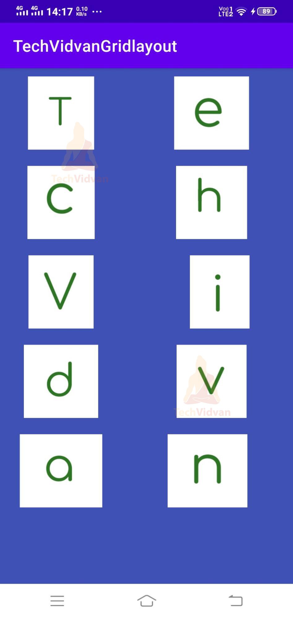
That’s it. Your GridLayout is now successfully implemented in your Android application. Now simply run your application, and you can see your GridLayout successfully created. Since we have kept rowCount as four and column count as 2. Therefore we see that we have two blocks in each row.
Summary
Through this article, you understood what a GridLayout is and how it is different from GridView. Later on, you saw the specifications, attributes, and methods of the GridLayout. Finally, you saw how you could implement GridLayout in your Android apps.