Android RadioGroup, RadioButton and Checkbox
In this article, we will dive into some essential UI elements that can significantly enhance user interaction: Android RadioButton, RadioGroup, and Checkboxes. These components are the building blocks of creating intuitive and interactive forms, surveys, and preference settings in your apps. Unlock the potential of these versatile UI elements and see how they can make your Android applications more dynamic and user-friendly. So let’s dive in!
What is a RadioButton in Android?
Android RadioButton has only two states: checked or unchecked. Apart from these, the radio button can’t have any other value. You can’t uncheck a checked RadioButton. The only way to uncheck is to select some other RadioButton belonging to that RadioGroup. Usually, RadioButtons are used to take mandatory inputs where the user has to choose something and can’t leave that field unchecked.
A very general example is while selecting your gender. You can’t leave the field empty; you need to choose either Male, female or prefer not to say.
Using the below code, you can create a RadioButton in Android.
XML Code:
<RadioButton android:id="@+id/your_radio_button"
                android:layout_width="wrap_content"
                android:layout_height="wrap_content"
                android:text="Samsung"
                android:onClick="onRadioButtonClicked"
/>
Attributes of RadioButton in Android
| Attribute Name | Description |
| android: id | The “id” attribute is used to identify your radio buttons uniquely. |
| android: checked | The “checked” property of radio buttons is by default false. If you keep it as true then the radio button is checked when your activity loads without you even clicking on it. |
| android: gravity | The “gravity” attribute is used to specify the alignment of the radio buttons. |
| android: text | The “text” attribute is used to specify the text that should appear beside the RadioButton. |
| android: textSize | The “textSize” attribute is used to specify the size of the text element that comes with your RadioButton. |
| android: textColor | The “textColor” attribute is used to specify the color of the text that appears beside the RadioButton. |
| android: padding | The “padding” attribute is used to specify the gapping between the element boundaries and the content of the RadioButton. |
| android: background | The “background” attribute is used to specify the color or image that should be present at the back of your RadioButton. |
| android: onClick | The “onClick” attribute is used to register a click event listener with your RadioButton. |
| android: textStyle | The “textStyle” attribute is used to specify the style of your text present in the RadioButton. (italic, bold or regular |
| android: visibility | The “visibility” attribute is used to hide or show your RadioButton. |
What is a RadioGroup in Android?
RadioGroup is a collection of various RadioButtons seeking responses for the same field. For example, if Male, Female, and Others are Radio Buttons, then Gender is the RadioGroup containing these values. The point to note is you can select only one RadioButton from a given set of RadioButtons in the RadioGroup.
The RadioGroup can have multiple RadioButtons depending on the scenario, but the user can select only from them at the end.
Using the below code, you can create a radio group in Android.
XML Code:
<RadioGroup
            android:layout_width="match_parent"
            android:layout_height="wrap_content"
            android:padding="10dp"
            android:orientation="vertical">

            <RadioButton android:id="@+id/your_radio_button"
                android:layout_width="wrap_content"
                android:layout_height="wrap_content"
                android:text="Samsung"
                android:onClick="onRadioButtonClicked"/>

        </RadioGroup>
What is a CheckBox in Android?
CheckBox has two states similar to RadioButton, i.e., checked or unchecked. The point to note is in CheckBox, and you can uncheck the box by yourself. Here if you select the other checkbox, then your current checkbox won’t be chosen. The user doesn’t have any restrictions while selecting checkboxes. They can even select all the checkboxes provided if they want.
Using the below code, you can create your checkbox in Android.
XML Code:
<CheckBox android:id="@+id/your_check_box"
               android:layout_width="wrap_content"
               android:layout_height="wrap_content"
               android:text="Java"
               android:onClick="onCheckboxClicked"/>
Attributes of Android CheckBox
| Attribute Name | Description |
| android: id | The “id” attribute is used to identify your checkboxes uniquely. |
| android: checked | Checkboxes’ “checked” attribute is set to false by default. If you keep it as true, then the check box is automatically checked when your activity loads without you even clicking on it. |
| android: gravity | The “gravity” attribute is used to specify the alignment of your checkboxes. |
| android: text | The “text” attribute is used to specify the text that should appear beside the CheckBox. |
| android: textSize | The “textSize” attribute is used to specify the size of the text that comes along with your CheckBox. |
| android: textColor | The “textColor” attribute is used to specify the color of the text that appears beside the CheckBox. |
| android: padding | The “padding” attribute is used to specify the gapping between the element boundaries and the content of the CheckBox. |
| android: background | The “background” attribute is used to specify the color or image that should be present at the back of your CheckBox. |
| android: onClick | The “onClick” attribute is used to register a click event listener with your CheckBox. |
| android: textStyle | The “textStyle” attribute is used to specify the style of your text present in the CheckBox. (italic, bold or regular) |
| android: visibility | The “visibility” attribute is used to hide or show your CheckBox. |
Implementation of Android RadioButton, RadioGroup, and CheckBoxes
We will try to make a quiz screen to see Multiple Choice Questions for the implementation. The MCQ will be of two types one will be single correct, and the other would be multiple correct. For the single option correct question, we will use RadioGroup and RadioButtons, while for the multi-option correct question, we will use the CheckBox.
So, follow the elbow steps to develop your quiz screen.
1: You need first to start your Android Studio and click on Create a new Project.
2: Now select an empty activity and then provide your project name and select API level22 and then click on Finish
3: Now open the actyivity_main.xml file of your project and paste the below code.
Code:activity_main.xml
<?xml version="1.0" encoding="utf-8"?>

<ScrollView
    xmlns:android="http://schemas.android.com/apk/res/android"
    xmlns:app="http://schemas.android.com/apk/res-auto"
    xmlns:tools="http://schemas.android.com/tools"
    android:layout_width="match_parent"
    android:layout_height="match_parent">

    <LinearLayout
        android:layout_width="match_parent"
        android:layout_height="match_parent"
        android:orientation="vertical"
        tools:context=".MainActivity">

        <TextView
            android:layout_width="match_parent"
            android:layout_height="wrap_content"
            android:text="TechVidvan Quiz Screen"
            android:textSize="30sp"
            android:textStyle="bold"
            android:textColor="#3F51B5"
            android:gravity="center"
            android:layout_marginTop="20dp"
            android:layout_marginBottom="20dp"
            android:id="@+id/title"/>

        <TextView
            android:layout_width="match_parent"
            android:layout_height="wrap_content"
            android:text="Which of the following company manufactures Iphone devices?"
            android:paddingLeft="20dp"
            android:paddingRight="20dp"
            android:textSize="18sp"
            android:layout_marginTop="10dp"
            android:textColor="@color/black"
            />

        <RadioGroup
            android:layout_width="match_parent"
            android:layout_height="wrap_content"
            android:padding="10dp"
            android:orientation="vertical">

            <RadioButton android:id="@+id/samsung"
                android:layout_width="wrap_content"
                android:layout_height="wrap_content"
                android:text="Samsung"
                android:onClick="onRadioButtonClicked"/>
            <RadioButton android:id="@+id/nokia"
                android:layout_width="wrap_content"
                android:layout_height="wrap_content"
                android:text="Nokia"
                android:onClick="onRadioButtonClicked"/>
            <RadioButton android:id="@+id/apple"
                android:layout_width="wrap_content"
                android:layout_height="wrap_content"
                android:text="Apple"
                android:onClick="onRadioButtonClicked"/>
            <RadioButton android:id="@+id/vivo"
                android:layout_width="wrap_content"
                android:layout_height="wrap_content"
                android:text="Vivo"
                android:onClick="onRadioButtonClicked"/>
        </RadioGroup>

        <TextView
            android:layout_width="match_parent"
            android:layout_height="wrap_content"
            android:text="Select Programming Languages from below"
            android:paddingLeft="20dp"
            android:paddingRight="20dp"
            android:textSize="18sp"
            android:layout_marginTop="10dp"
            android:textColor="@color/black"
            />

        <LinearLayout
            android:layout_width="match_parent"
            android:layout_height="wrap_content"
            android:orientation="vertical"
            android:padding="10dp">

            <CheckBox android:id="@+id/python"
                android:layout_width="wrap_content"
                android:layout_height="wrap_content"
                android:text="Python"

                android:onClick="onCheckboxClicked"/>
            <CheckBox android:id="@+id/java"
                android:layout_width="wrap_content"
                android:layout_height="wrap_content"
                android:text="Java"
                android:onClick="onCheckboxClicked"/>

            <CheckBox android:id="@+id/kotlin"
                android:layout_width="wrap_content"
                android:layout_height="wrap_content"
                android:text="Kotlin"
                android:onClick="onCheckboxClicked"/>

            <CheckBox android:id="@+id/Windows"
                android:layout_width="wrap_content"
                android:layout_height="wrap_content"
                android:text="Windows"
                android:onClick="onCheckboxClicked"/>

            <CheckBox android:id="@+id/Ubuntu"
                android:layout_width="wrap_content"
                android:layout_height="wrap_content"
                android:text="Ubuntu"
                android:onClick="onCheckboxClicked"/>

        </LinearLayout>

        <Button
            android:layout_width="wrap_content"
            android:layout_height="wrap_content"
            android:layout_gravity="center"
            android:text="Submit"
            android:onClick="checkResponses"
            />


    </LinearLayout>

</ScrollView>
4: After you are done with your layout designing, you need to open your MainActivity.kt file and paste the below code.
Code: MainActivity.kt
package com.techvidvan.techvidvanradiocheck

import androidx.appcompat.app.AppCompatActivity
import android.os.Bundle
import android.view.View
import android.widget.CheckBox
import android.widget.RadioButton
import android.widget.Toast

class MainActivity : AppCompatActivity()
{
    //declaring variables

    var python = false
    var java = false
    var kotlin = false
    var apple = false

    override fun onCreate(savedInstanceState: Bundle?)
    {
        super.onCreate(savedInstanceState)
        setContentView(R.layout.activity_main)
    }

    fun checkResponses(view: View) {

        //checking if your responses are correct or not
        if(apple && python && java && kotlin)
        {
            Toast.makeText(this@MainActivity, "Your responses are correct", Toast.LENGTH_LONG).show()
        }
        else
        {
            Toast.makeText(this@MainActivity, "Your responses are incorrect. Please try again :(", Toast.LENGTH_LONG).show()
        }
    }

    fun onCheckboxClicked(view: View)
    {
        //checking if checkbox is clicked
        if (view is CheckBox) {
            val checked: Boolean = view.isChecked

            //check which Checkbox was pressed
            when (view.id)
            {
                //if python or java or kotlin are selected then
                //keep their values
                //in their variables
                R.id.python -> {
                    python = checked
                }
                R.id.java -> {
                    java = checked
                }
                R.id.kotlin -> {
                    kotlin = checked
                }
            }
        }
    }

    fun onRadioButtonClicked(view: View)
    {
        if (view is RadioButton) {

            val checked = view.isChecked

            // Check which radio button was pressed
            when (view.id)
            {
                //if you selected apple then change its value
                R.id.apple ->
                  apple = checked
            }
        }
    }
}
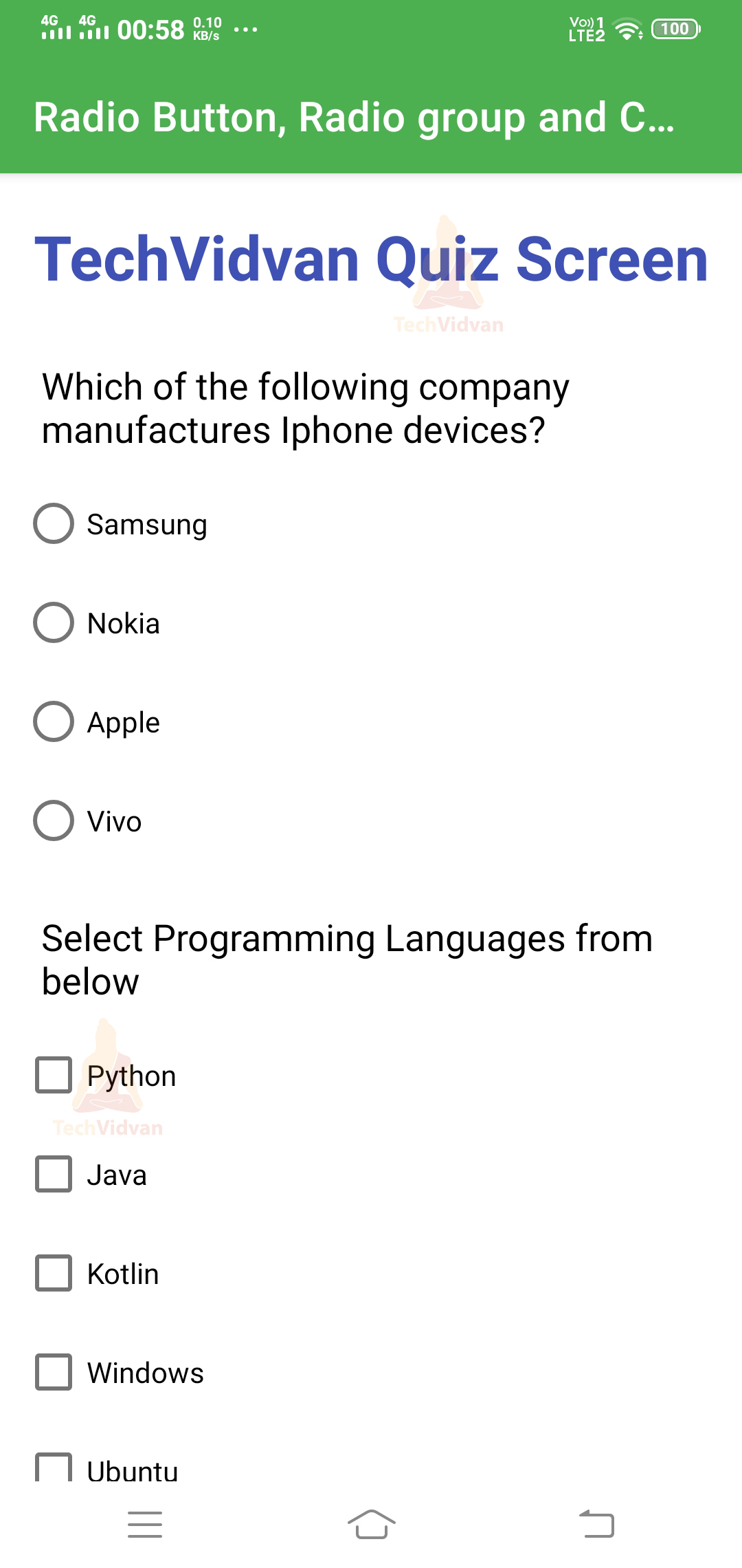
Now run your application, and then you will find a screen like below.
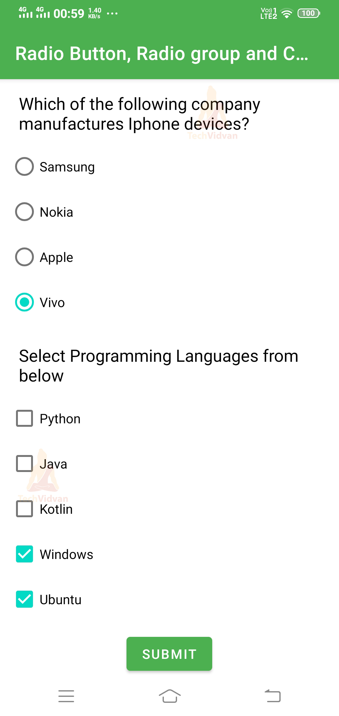
After you select your desired responses in the application, then the screen will appear as follows.
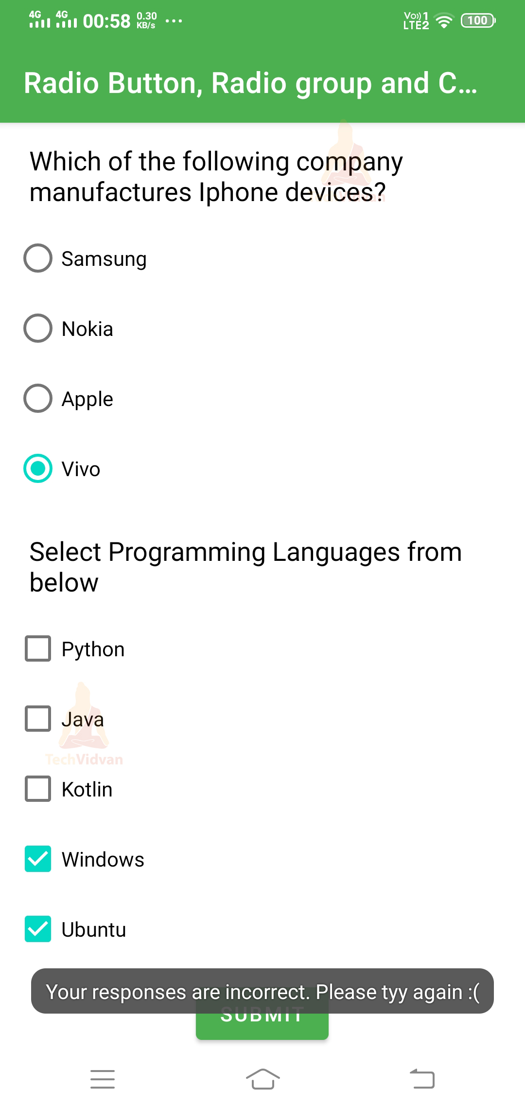
Now click on Submit. You can notice that your responses are wrong, and you got a Toast stating the same.
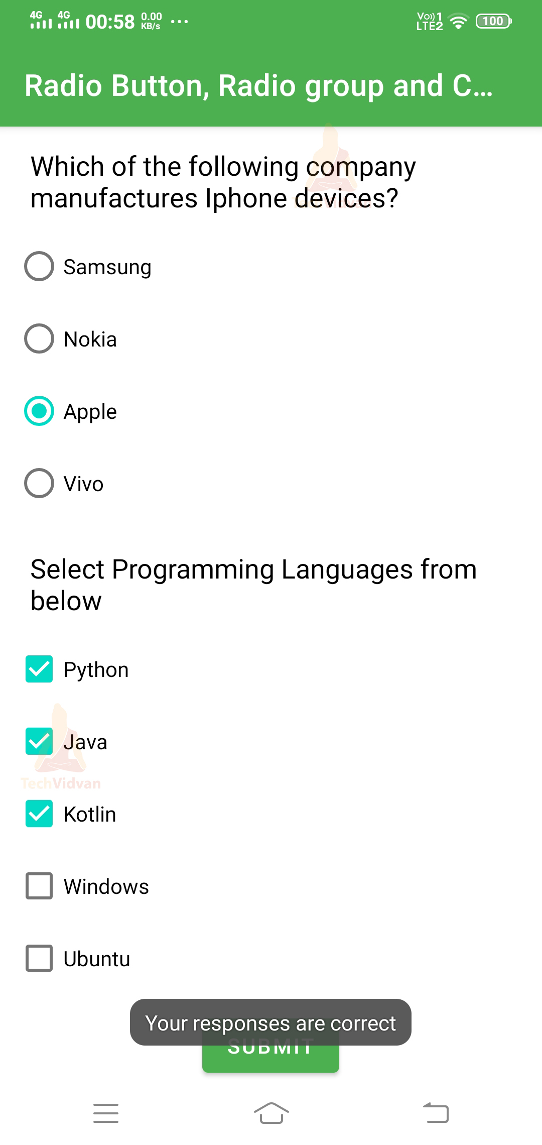
Let’s see by putting the correct responses, and you will receive a Toast stating that your answers are correct.
Summary
So, through this article, you came across Android RadioButton, RadioGroup, and Checkbox. You got to know what each of them means and how you can add them to Android. Moving further, you saw the attributes of RadioButton and CheckBoxes. Finally, you came across the implementation of the three of them by developing a quiz screen.